
How to Create a Report in Salesforce
Salesforce reports help you turn raw organizational data into insights you can act on. This guide walks you through how to create a report in Salesforce, from accessing the Reports tab to adding filters, columns, grouping, charts, and organizing your finished reports into shared folders.
Video: Create a Salesforce Report in Under 5 Minutes [Easy Tutorial] by Salesforce Ben (2023). All credit for the demonstration goes to the creator; watch the original on YouTube. The written guide below was generated from this video by Docsie. Creator? Request a change or removal.
Salesforce reports help you turn raw organizational data into insights you can act on. This guide walks you through how to create a report in Salesforce, from accessing the Reports tab to adding filters, columns, grouping, charts, and organizing your finished reports into shared folders.
Prerequisites
- An active Salesforce account with login credentials.
- Access to the standard or custom report types you plan to use (for example, Accounts).
Access the Reports tab
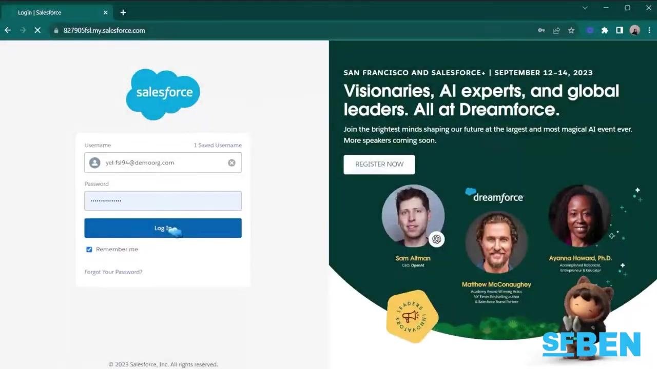
Log in to your Salesforce account using your username and password.
Locate the Reports tab in the main navigation menu at the top of the screen. If you don't see it, click the nine-dot grid icon (App Launcher) in the upper left corner, type "Reports" in the search bar, and select it from the results.
Start a new report
On the Reports page, click the New Report button to begin creating a new report.
Choose a report type
In the Create Report dialog, browse or search for the report type that matches the data you want to analyze. If you have custom report types, select the one that fits your needs. For this example, select the standard Accounts report type.
Add filters to narrow down data
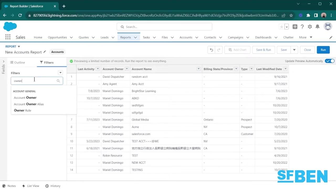
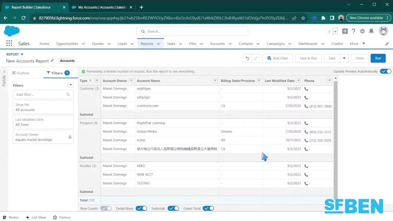
After selecting your report type, use the Filters section to refine your data. Click the Add filter field, then choose the field you want to filter by, such as Date, Owner, or another relevant criterion. For example, type "owner" in the filter search box and select Account Owner to filter by owner.
You can enable Update Preview Automatically (toggle in the upper right) to see changes reflected in real time as you adjust filters.
Preview and adjust your report
Review the data preview to confirm your filters are applied correctly. Continue adding or adjusting filters as needed to focus on the most relevant data for your analysis.
Add columns to your report
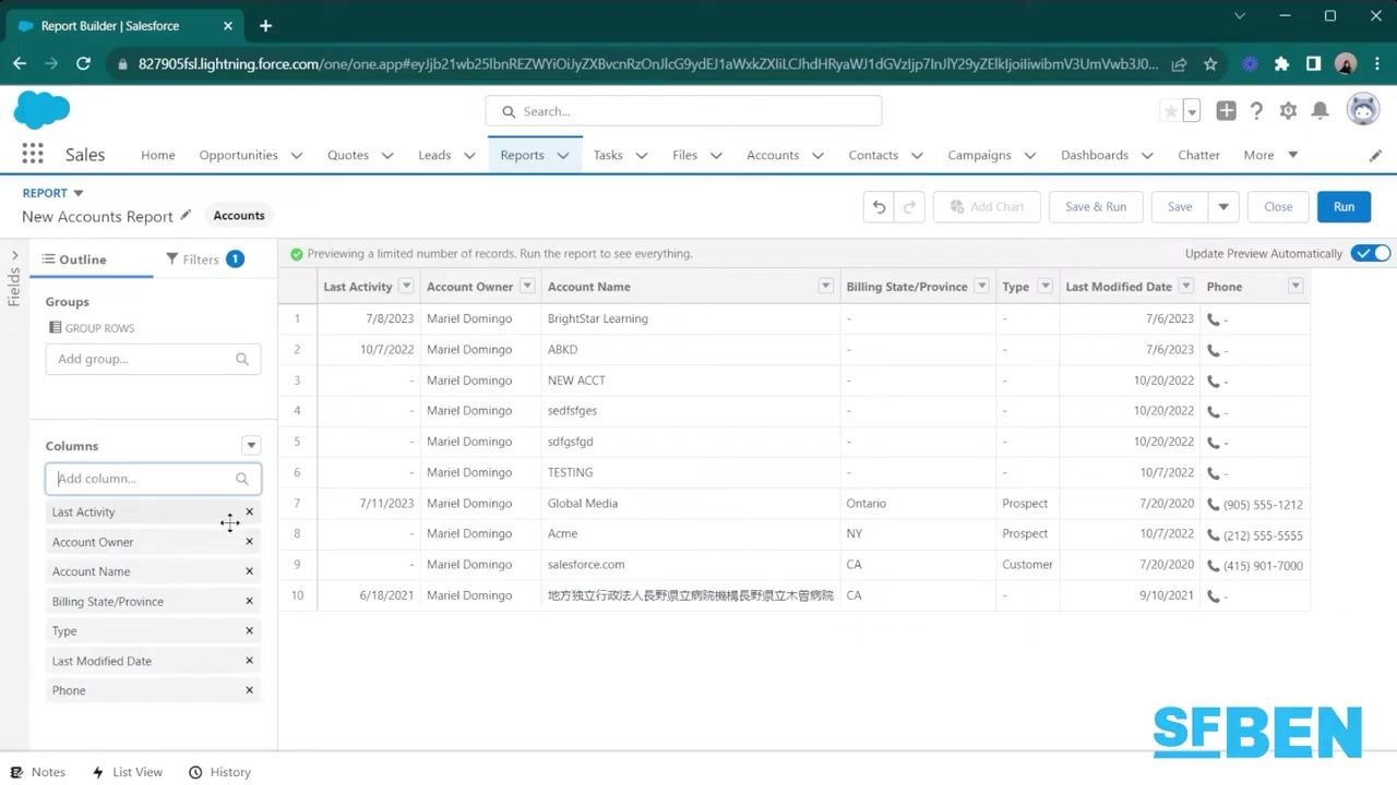
In the Report Builder, locate the Columns section on the left sidebar. Click the Add column... field and type the name of the field you want to add, such as "phone," then select Phone from the dropdown list.
The new column appears on the far right of your report results. To remove a column, click the X next to its name in the Columns list. For example, you can add the Phone column and remove the Last Activity column.
Group data for summaries and trends
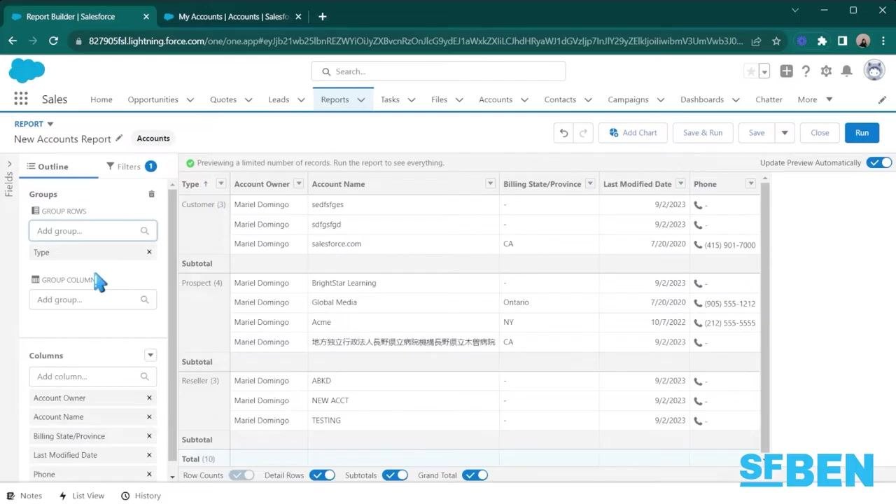
To group your data, find the Group Rows section on the left sidebar. Click the Add group... search box, then type and select the field you want to group by, such as "Type."
The report now displays grouped rows, such as by Account Type (Customer, Prospect, Reseller), with subtotals for each group.
Run the report
After setting up your filters, columns, and grouping, click the blue Run button in the upper right corner. The report generates and displays data based on your current settings.
Running the report does not save it—use this feature to preview and verify your setup. At the bottom of the report, use the toggles to show or hide Detail Rows, Subtotals, and Grand Total as needed.
Add a chart to visualize your data
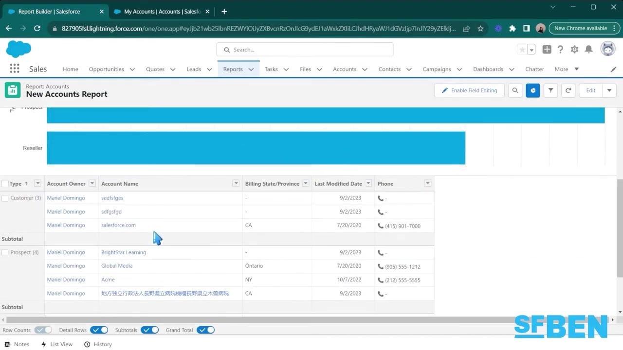
To add a chart or graph, click the Add Chart button above the report preview and choose the chart type that best visualizes your data, such as a bar chart.
For example, you can add a bar chart to display Account Type and its record count. You can toggle the chart display, add more filters, or change the chart type as needed.
Review and export your visualization
Review the chart to confirm it accurately represents your grouped data. The chart displays each Account Type (Customer, Prospect, Reseller) along with the number of records for each.
To export the report or chart, click the dropdown arrow next to the Edit button and select Export.
Save your report
Once you're satisfied with your report, click the Save button. Enter a report name and choose the folder where you want to save it, such as Public Reports. Share the report with your team or organization as needed.
Create a folder to organize your report
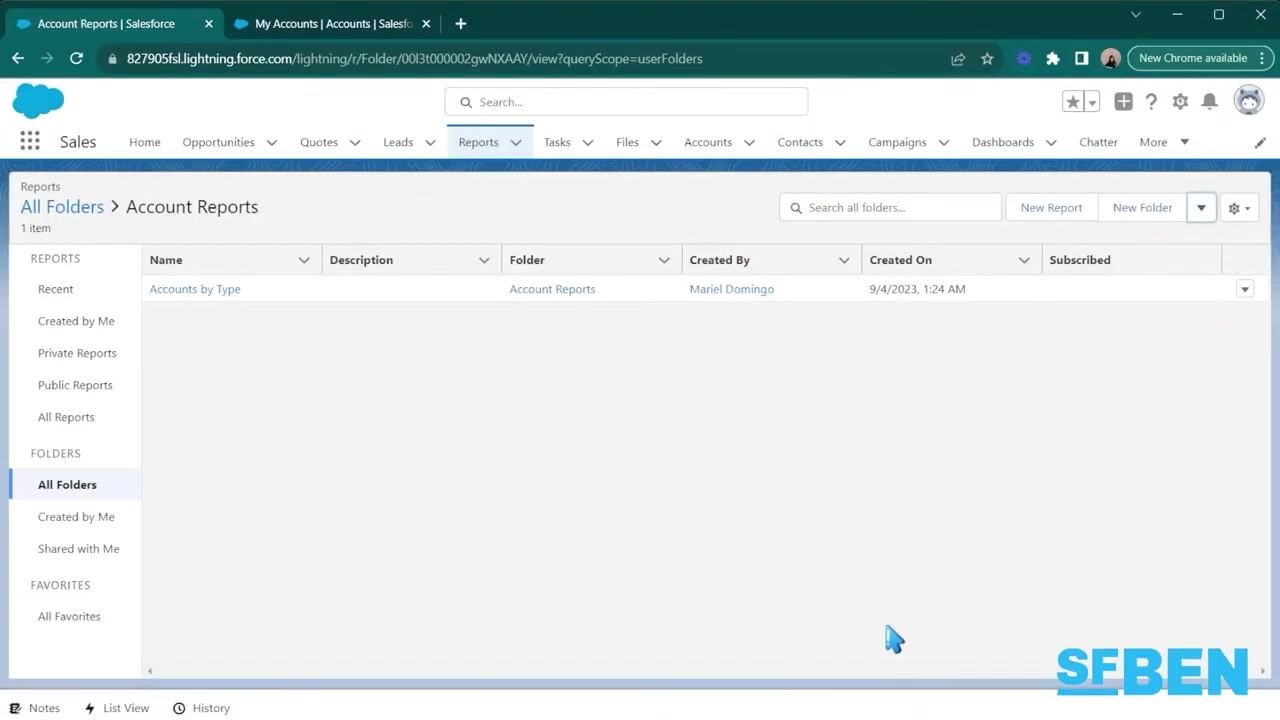
In the Reports section, click the New Folder button at the top right of the report list, then enter a folder name such as "Account Reports" and confirm creation.
This folder helps you organize related reports and manage sharing settings. For example, you can create a folder named "Account Reports" for storing account-related reports.
Move your report into the new folder
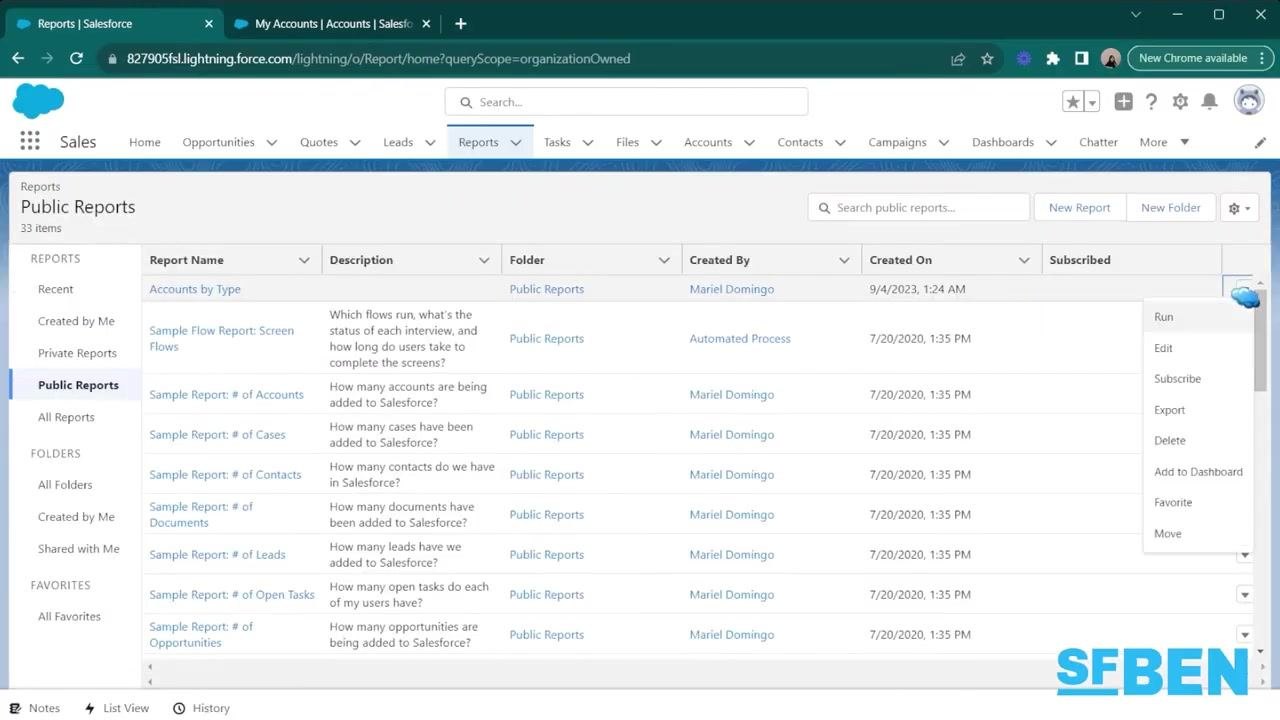
Locate your report, such as "Accounts by Type," in the report list. Use the dropdown menu next to the report name and select Move, then choose the "Account Reports" folder as the destination.
Confirm the move to organize your report within the new folder.
Manage sharing settings for the folder
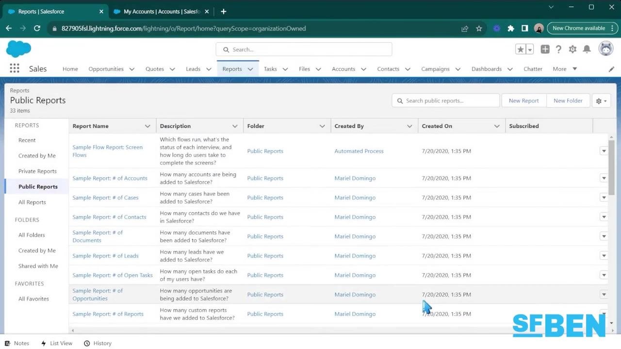
Navigate to the "Account Reports" folder under All Folders and select it to view its contents. Click the sharing or settings icon to manage access.
Share the folder with specific users or groups and set an access level for each:
- View: Users can only view reports in the folder.
- Edit: Users can view and edit reports in the folder.
- Manage: Users can view, edit, and manage sharing for the folder.
For example, you can share "Account Reports" with your team and grant Edit access to team leads.
Review your final report
Open the "Accounts by Type" report from the "Account Reports" folder and review the grouped data, columns, and any visualizations you've added.
Confirm that details such as Account Owner, Account Name, Billing State/Province, Last Modified Date, and Phone are correct, and that subtotals and grand totals display as needed.
Summary
You now know how to create a report in Salesforce: accessing the Reports tab, selecting a report type, applying filters, adding columns, grouping data, running the report, adding charts, and saving and organizing it into shared folders. These steps let you visualize and analyze your organization's data effectively while keeping your reports accessible and secure for your team.
What's next
- Experiment with different report types and visualizations to find the best fit for your data analysis needs.
- Use additional charts, graphs, and filters to uncover deeper insights.
- Refine your folder organization and sharing settings to streamline collaboration across your team.
Generation details: cost, quality tiers
Docsie billed 2,500 credits ($1.75) to analyze this 5-minute video at standard quality. The rewrite, template fill and Word/PDF exports were included. The same video at each quality tier:
| Quality | Frames sampled | Credits | Approx. cost |
|---|---|---|---|
| Draft | every 16-30 s | 1,250 | $0.88 |
| Standard (this guide) | every 8-15 s | 2,500 | $1.75 |
| Detailed | every 4-7 s | 5,000 | $3.50 |
| Ultra | every 1-3 s | 10,000 | $7.00 |
Credits priced at $0.70 per 1,000; plans include a monthly allowance. Enterprise customers on on-premise or bring-your-own-model deployments run this on their own inference and pay no per-video credits.
Generated by Docsie Video-to-Docs on 2026-10-02 from a 4-minute video. Screenshots are frames from the source video and belong to their creator, Salesforce Ben, whose original is embedded above. If you own this video and want the guide removed or credited differently, contact us and we will act within one business day.