
How to Create a Dashboard in Salesforce
Salesforce dashboards let you visualize and monitor key business metrics at a glance. This guide walks you through how to create a dashboard in Salesforce Lightning, from preparing a properly grouped source report to adding chart components, applying filters, and subscribing to automatic email updates.
Video: Dashboards in Salesforce | How to create a dashboard in Salesforce | Dashboard Basics by Salesforce Emily. All credit for the demonstration goes to the creator; watch the original on YouTube. The written guide below was generated from this video by Docsie. Creator? Request a change or removal.
Salesforce dashboards let you visualize and monitor key business metrics at a glance. This guide walks you through how to create a dashboard in Salesforce Lightning, from preparing a properly grouped source report to adding chart components, applying filters, and subscribing to automatic email updates.
Prerequisites
Before you build a dashboard, make sure the following are in place:
- Access to the Reports and Dashboards tabs in your Salesforce navigation bar (or through the App Launcher).
- At least one report that is grouped by a field, such as Stage. Grouping is required because dashboards use grouped data to build charts; without grouping, only tabular (list or table) components are available.
- Permission to create dashboards in the folder you intend to use, whether private or shared.
Review your source reports
Dashboards rely on underlying reports, so the first step is confirming your reports are structured correctly.
- Navigate to the Salesforce Home page. The navigation bar at the top includes tabs such as Opportunities, Leads, Tasks, Files, Accounts, Contacts, Campaigns, Dashboards, Reports, Chatter, Groups, and More. On the Home tab you'll see widgets including Quarterly Performance (showing CLOSED, OPEN, and GOAL metrics with a graph area), Assistant (which flags items needing your attention), and Today's Events and Today's Tasks (summarizing your schedule and pending work).
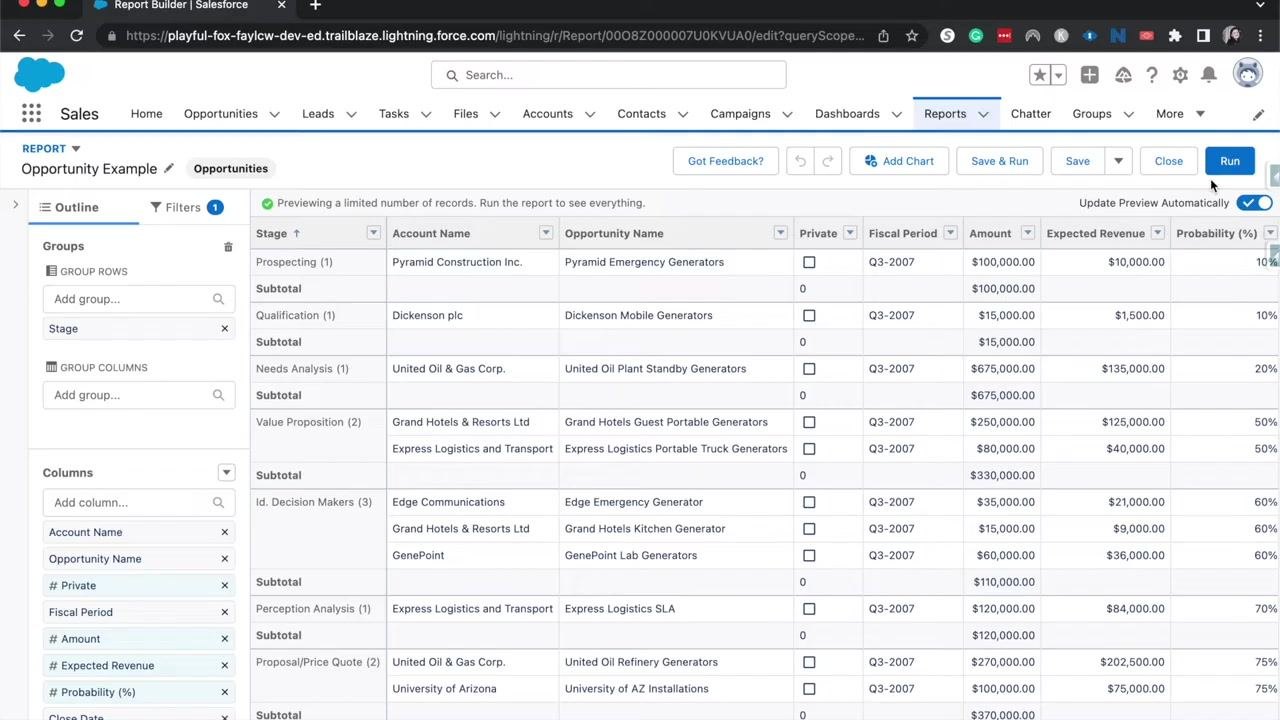
- Click the Reports tab and open a report, for example "Opportunity Example." This report lists opportunities grouped by stage, with columns such as Stage, Account Name, Opportunity Name, Private, Fiscal Period, Amount, Expected Revenue, Probability (%), Close Date, and Created Date. Opportunities are grouped into stages like Prospecting, Qualification, Needs Analysis, Value Proposition, Id. Decision Makers, Perception Analysis, and Proposal/Price Quote, with a subtotal row for each stage.
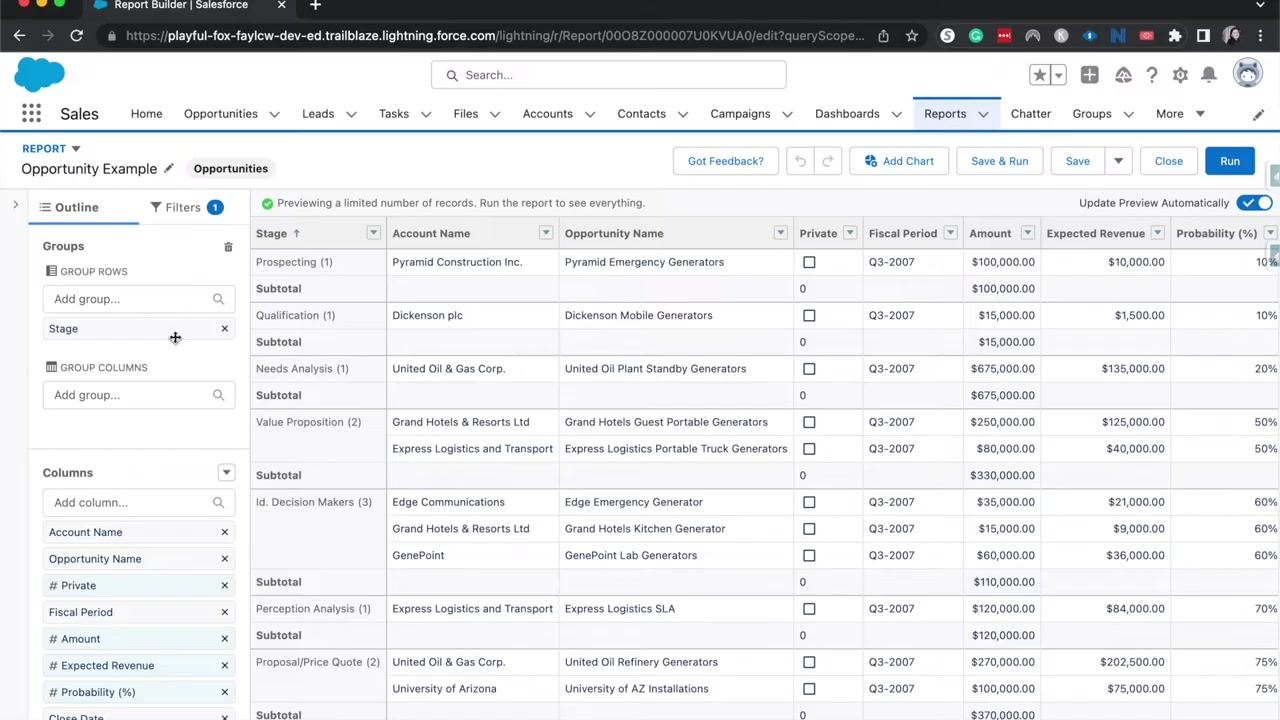
- Click Edit to open the report editor and confirm the report is grouped by the field you want, such as "Stage," under GROUP ROWS in the left sidebar. The preview updates to show opportunities organized by their respective stages. The left sidebar also lets you add or remove columns and groups.
Grouping by a field such as Stage is what enables dashboards to visualize the data using charts and other components. Without this grouping, only tabular components are available.
Add a chart to your report
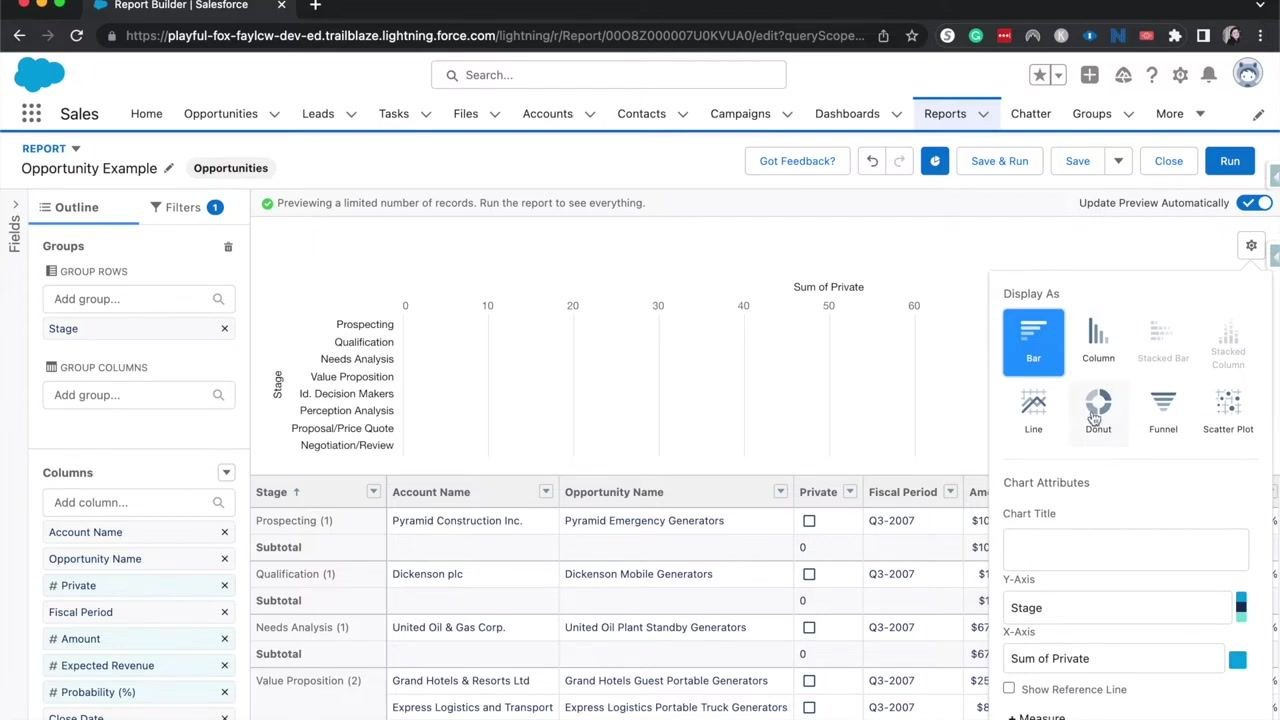
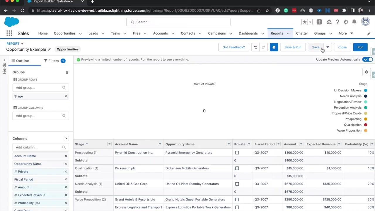
- In the report editor, click Add Chart at the top. A chart appears above the report data, visualizing the grouped information (for example, by Stage). You can further customize the chart's properties as needed.
- Click the chart settings (gear icon) to review available chart types, including Bar, Column, Stacked Bar, Stacked Column, Line, Donut, Funnel, and Scatter Plot. The best chart type depends on the nature of your data.
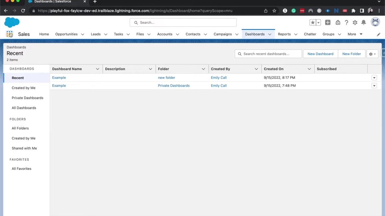
Open the Dashboards tab
- Click the Dashboards tab in the Salesforce navigation bar. If you don't see it, click the App Launcher (the 3x3 grid icon in the top left), then search for and select "Dashboards."
Create a new dashboard
- In the Dashboards section, click New Dashboard in the upper right.
- In the New Dashboard dialog, enter the following:
- Name: Example Opportunity Dashboard
- Description: Optional — leave blank or add a description as needed
- Folder: Private Dashboards by default, or click Select Folder to choose another location
A dashboard saved in Private Dashboards can only be viewed or edited by you. To share the dashboard with others, choose a shared folder, such as "Sales and Marketing Reports" or "Lead Gen," instead. Click Create to proceed.
- If you want others to access or edit the dashboard, select a shared folder rather than Private Dashboards, for example "Sales and Marketing Reports" or "Lead Gen."
- After creating the dashboard, you'll see a blank canvas titled "Example Opportunity Dashboard," ready for you to add components and build your layout.
Add a report component to your dashboard
-
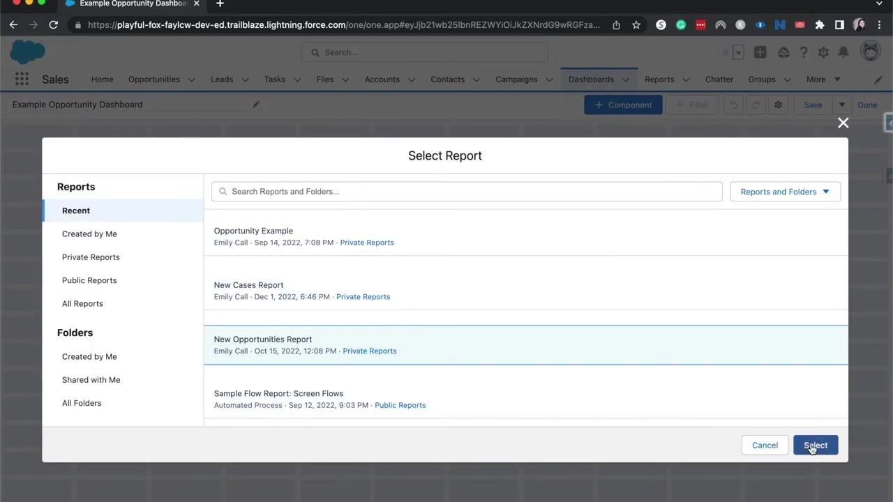
Click + Component at the top of the dashboard builder.
-
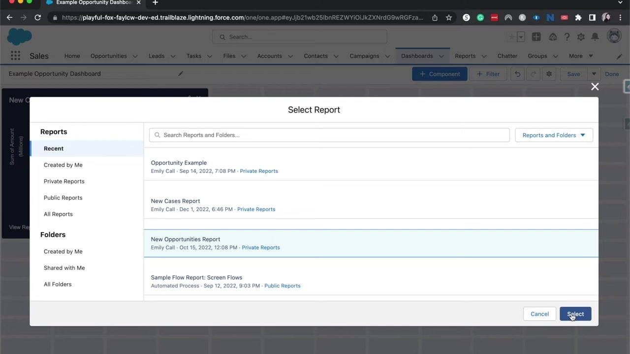
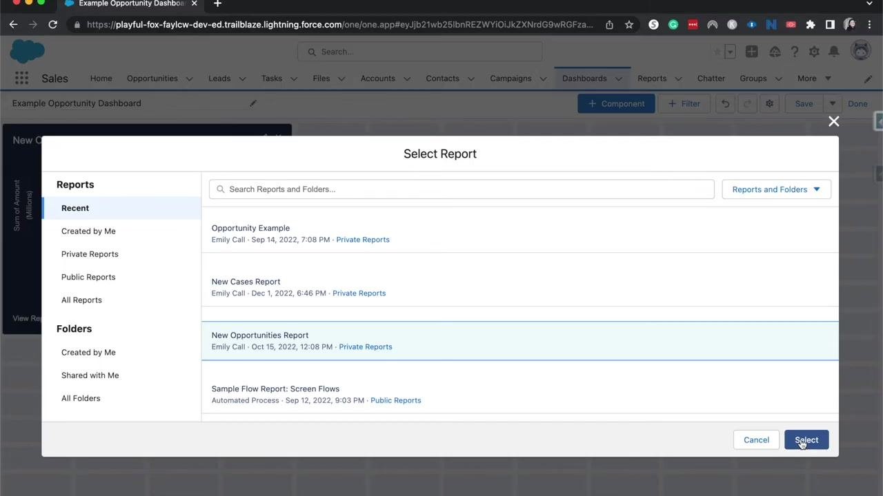
In the Select Report dialog, search for and select the report you want to visualize, for example "New Opportunities Report," then click Select to add it as a component.
Configure the component's axes and display options
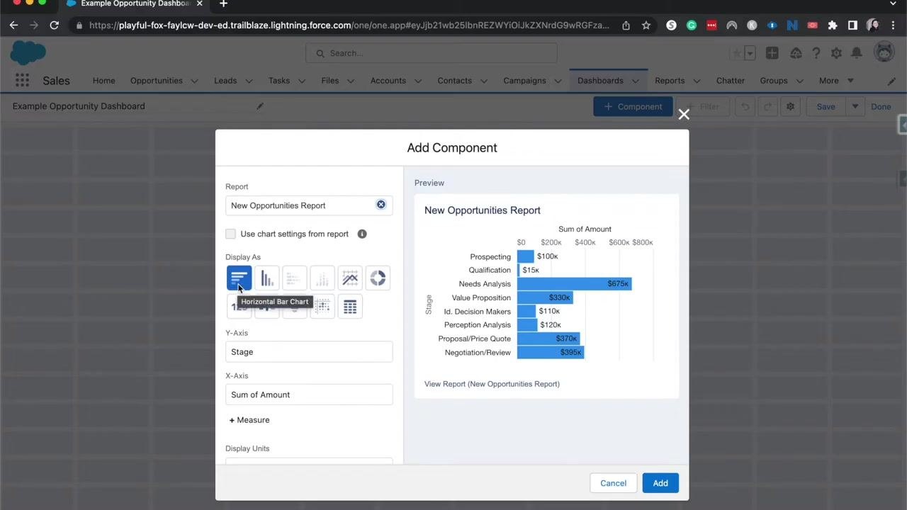
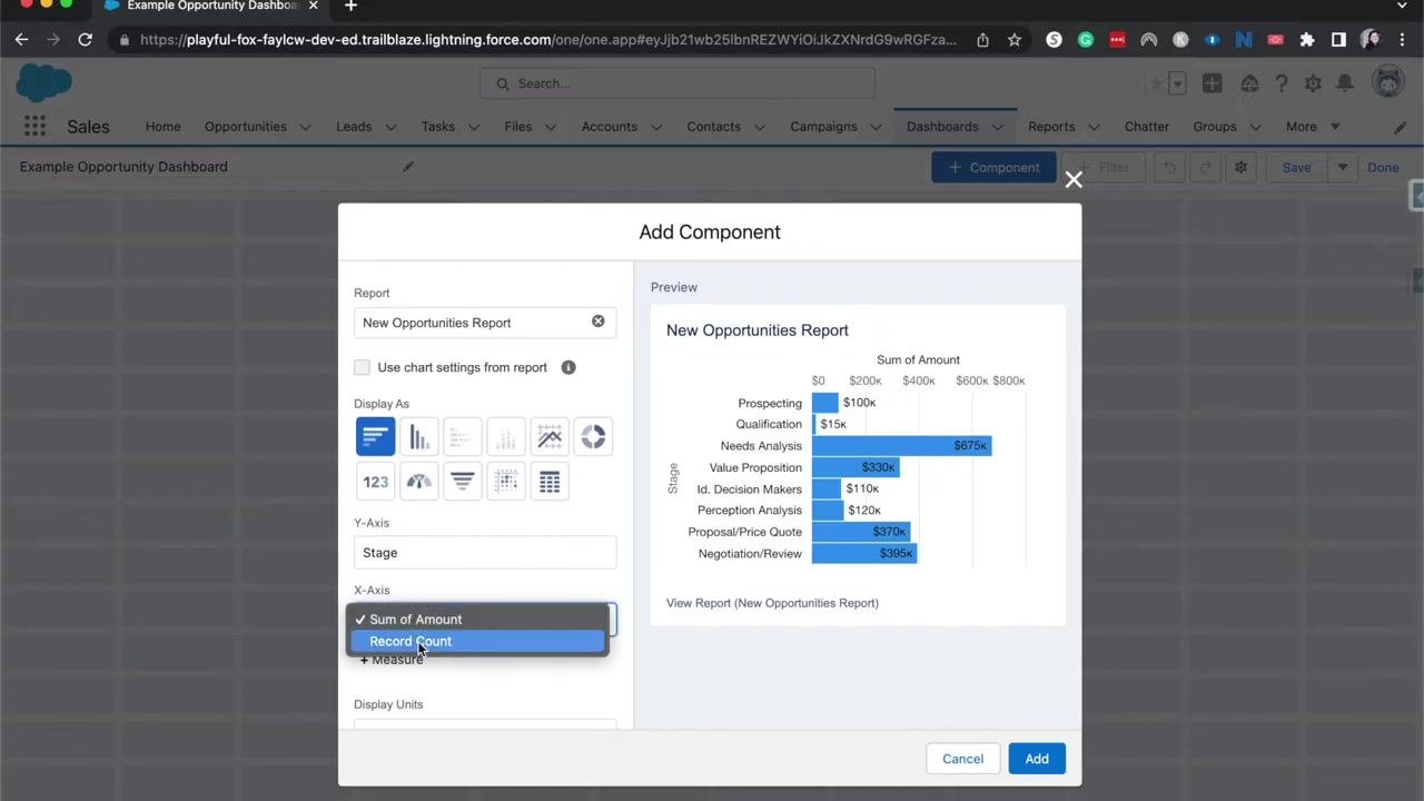
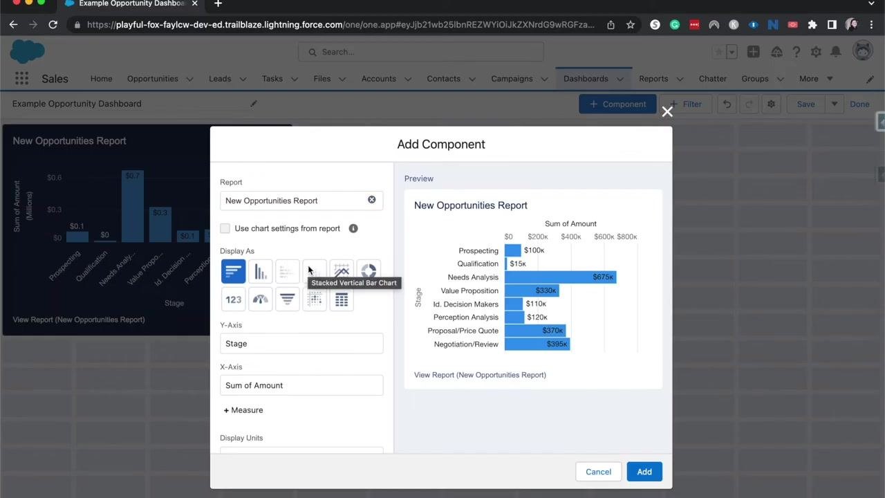
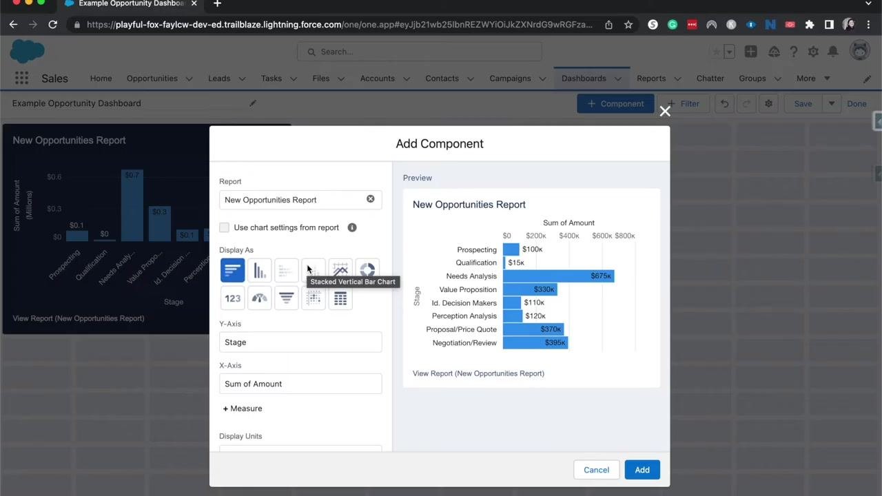
- Because the report is grouped by the opportunity's Stage, Salesforce uses that grouping to define the component's axes. In the example, Stage appears on the y-axis and "Sum of Amount" on the x-axis, and the preview panel shows a horizontal bar chart with opportunity stages and their corresponding amounts.
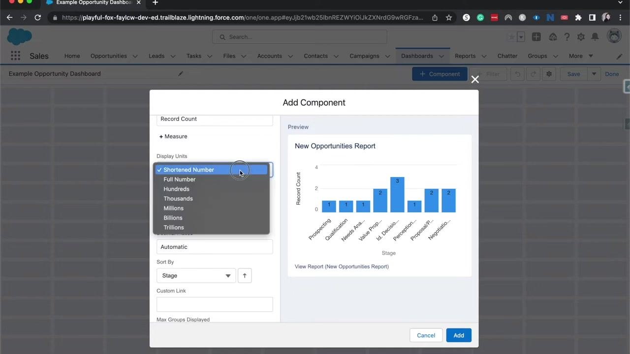
- To change the x-axis, click the dropdown under X-Axis. Options include:
- Sum of Amount — total value per stage
- Record Count — number of opportunities per stage
Select "Record Count" if you want to display how many opportunities exist in each stage.
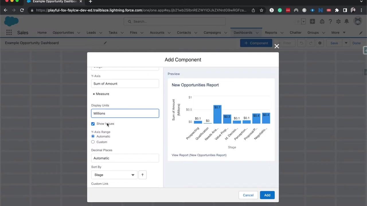
- Scroll down to Display Units and choose the unit that best fits your audience or reporting needs:
- Shortened Number (for example, 675k)
- Full Number (for example, 675,000)
- Hundreds
- Thousands
- Millions
- Billions
- Trillions
-
Check Show Values to display the value of each bar directly on the chart, so viewers can quickly see the exact value for each stage.
-
Set the y-axis range to Automatic to let Salesforce determine the best range, or choose Custom to manually set the minimum and maximum values — useful for aligning with company goals or specific targets.
-
As you adjust these settings, the preview panel updates in real time. For example, switching Display Units to "Millions" shows values like $0.7 for $700,000.
- You can continue adjusting sorting, decimal places, and custom links as needed. When you're satisfied, click Add to insert the component into your dashboard.
Add and configure another component
-
Open the dashboard and click + Component again to add another component.
-
In the Add Component dialog:
- Select the report you want to use, for example "New Opportunities Report."
- Under Display Units, choose "Millions."
- Make sure Show Values is checked to display data values on the chart.
- Set Y-Axis Range to "Automatic" or "Custom" (entering minimum and maximum values if custom).
- Set Decimal Places to "Automatic" or specify a value.
- In the Sort By dropdown, select the field to sort by, such as "Stage."
- Optionally add a custom link.
- Review the chart preview to confirm your settings.
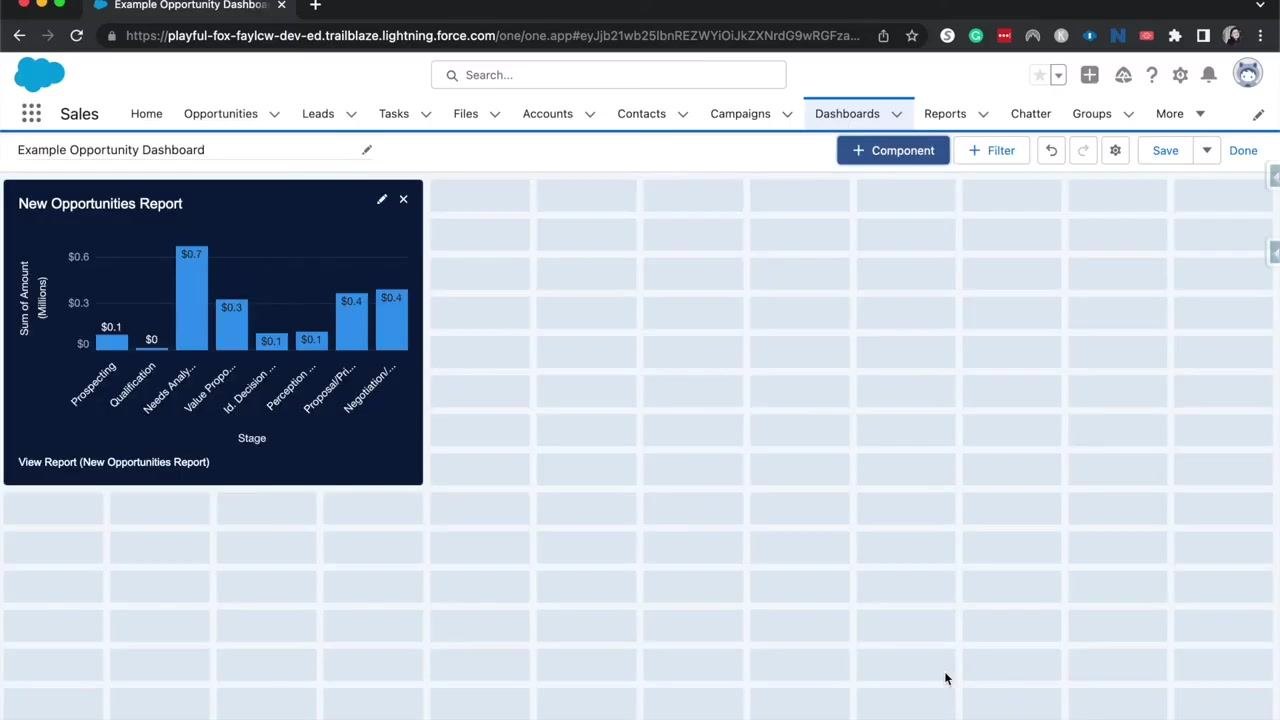
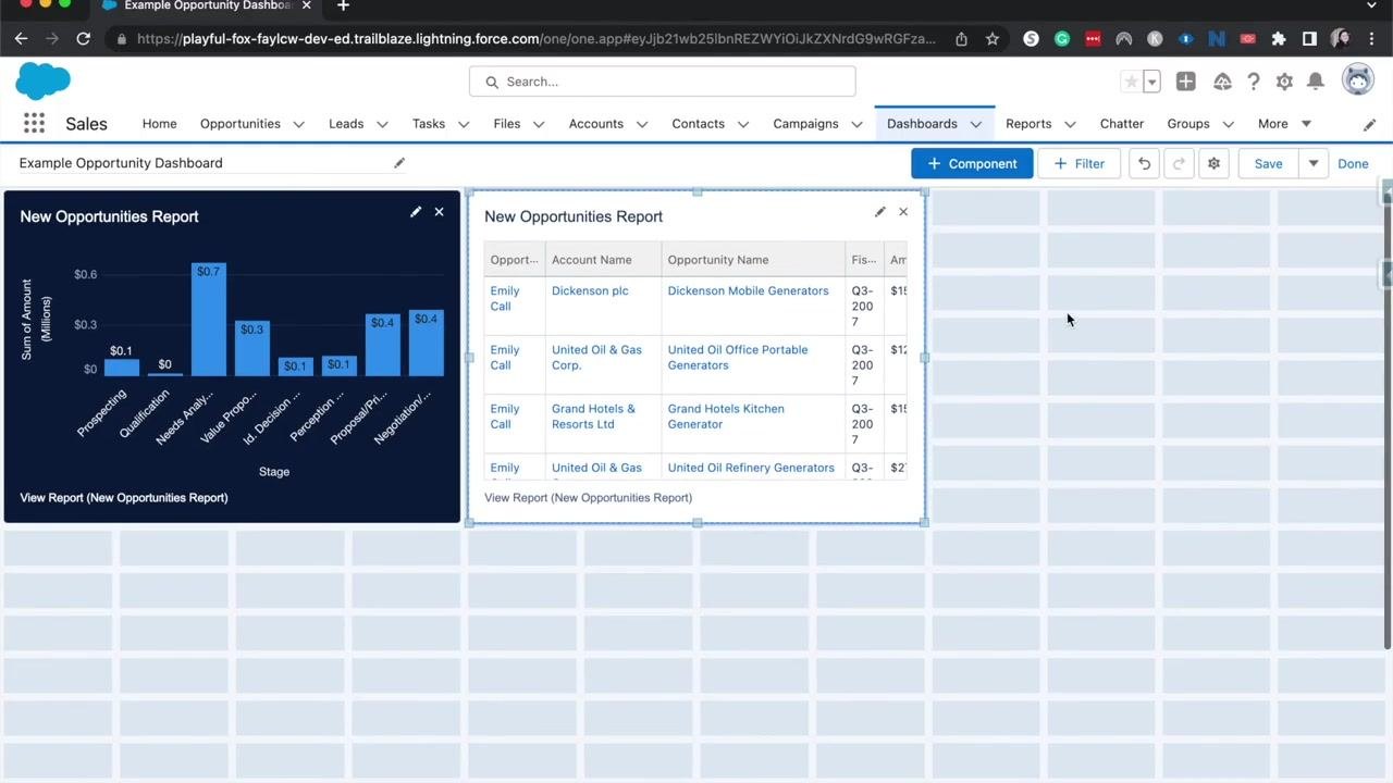
- Click Add to insert the component. It appears on the dashboard as a chart — for example, a bar chart showing the sum of amounts by stage, with values for each stage such as Prospecting, Qualification, and Needs Analysis.
Add multiple components from different reports
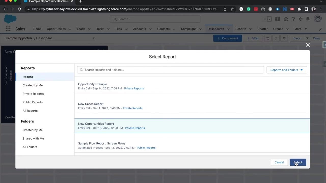
- Click + Component again. Click Select Report to choose from recent, private, public, or all reports, and use the search bar to find specific reports or folders.
- You can add multiple components sourced from different reports to visualize various business metrics or goals on the same dashboard — useful for comparing sales productivity, service productivity, or other key performance indicators. Select each report and click Select to add it.
- Continue adding components as required for your analysis — for example, a "New Cases Report" or a "Sample Flow Report: Screen Flows" for broader insights.
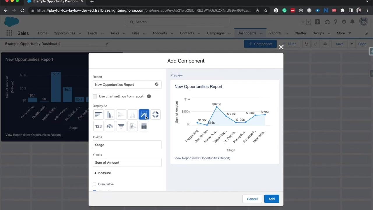
- In the Add Component dialog, under Display As, select a chart type such as vertical bar, horizontal bar, stacked bar, or line chart, and the preview updates to reflect your selection. Note that some chart types, like stacked charts, may require additional groupings in your source report.
Choose the best chart type for each component
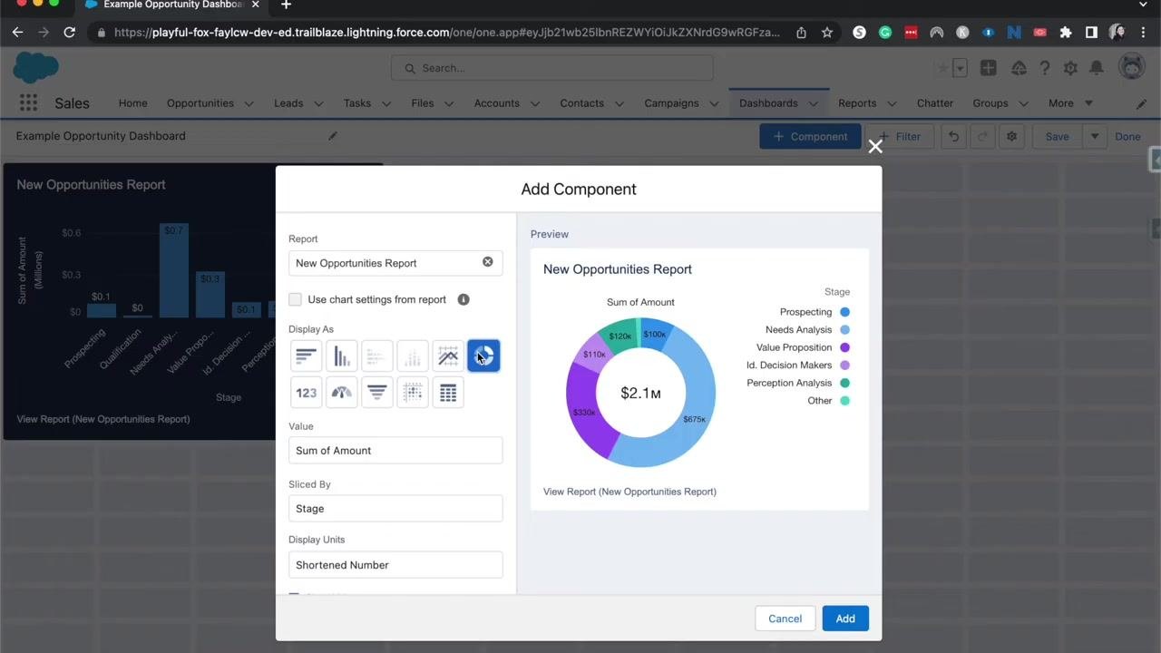
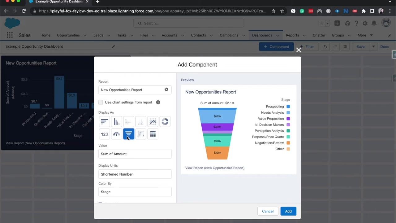
Salesforce offers several chart types under Display As, including vertical bar, horizontal bar, stacked bar, line chart, donut chart, and metric. Previewing each type helps you decide which one best represents your data.
- Stacked Vertical Bar Chart — Select this icon to display opportunity stages as horizontal bars, each showing the sum of amount for that stage (for example, Prospecting: $100k, Qualification: $15k, Needs Analysis: $675k). The X-axis shows the sum of amount and the Y-axis shows the stage.
- Line Chart — Select this icon to plot the sum of amount for each stage as a line graph (for example, Prospecting: $100k, Needs Analysis: $675k, Value Proposition: $330k). This type is useful for visualizing trends across stages.
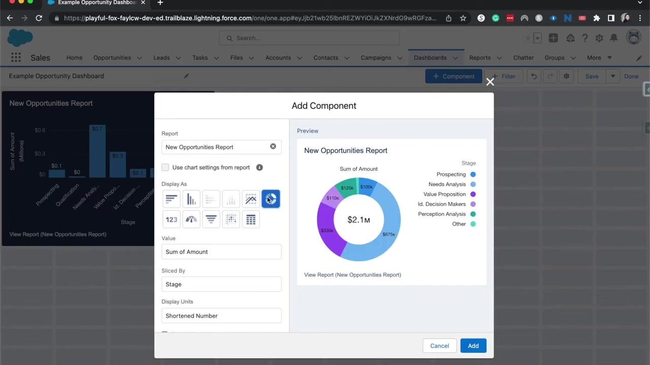
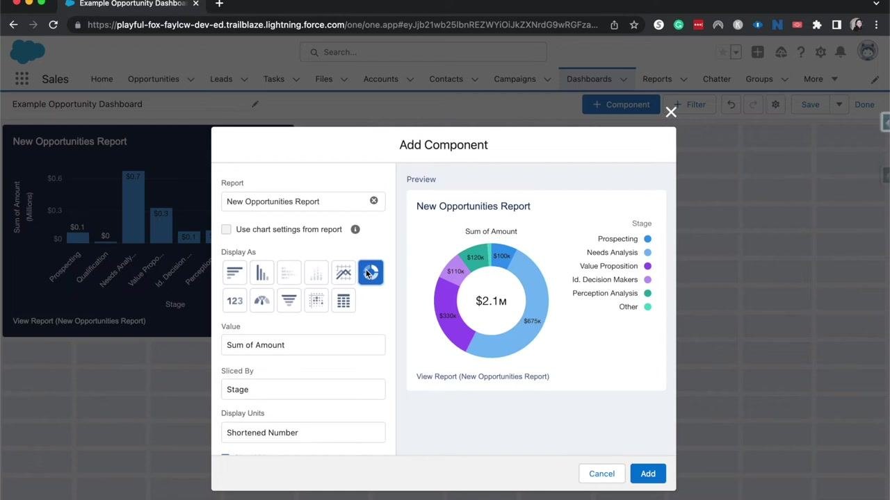
- Donut Chart — Select this icon to display the sum of amount for each stage as colored segments. The center of the donut shows the total (for example, $2.1M), and a legend on the right lists each stage with its corresponding color. This type is ideal for showing proportions and distribution across categories.
- Metric — Select the metric icon (123) to display a large, single value representing the sum of amount (for example, $2.1M). This is useful for highlighting a key number at a glance.
- Metric ranges — With Metric selected, check Show Range to enable range indicators, then enter values for the ranges (for example, 33 and 67). The preview displays colored bars — red, yellow, and green — to indicate where the metric falls within the defined ranges, helping you quickly assess whether a value is acceptable, in warning, or critical.
You can also set Decimal Places to "Automatic" or a specific value, and review the live preview before clicking Add to save the component, or Cancel to discard it.
- Gauge Chart — Select the gauge icon to show a gauge visualization of the sum of amount (for example, $2.1M) with tick marks at defined intervals, such as $0, $423k, $846k, $1.3M, $1.7M, and $2.1M. Set up segment ranges in the Segment Ranges field (for example, entering 0 as the starting value), and customize colors for each range for quick visual assessment. This type is useful for tracking progress toward a target or goal.
- Funnel Chart — Select the funnel icon to break down the sum of amount by opportunity stage. Each segment is color-coded and labeled with the stage name and value, with a matching legend on the right. This type is ideal for visualizing the flow of opportunities through sales stages.
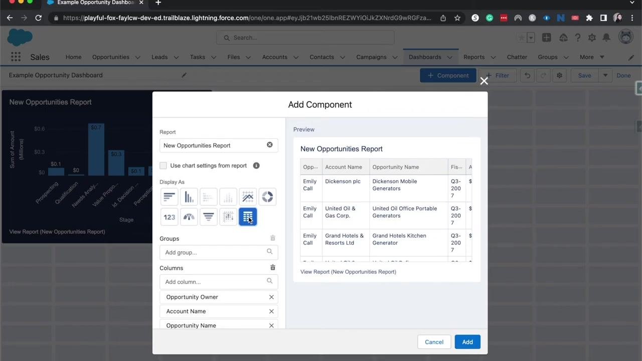
- Tabular Component — Select the table icon to display a list of opportunities with columns such as Opportunity Owner, Account Name, Opportunity Name, Fiscal Period, and Amount. This format shows individual records, making it suitable for detailed lists such as expiring opportunities or contracts. You can add or remove columns and groups as needed.
- Tables are best suited for displaying a list of records, such as expiring opportunities or contracts. Keep in mind there may be a maximum number of records displayed, such as the five most recent or top records. Scroll through the preview to review the full list.
-
Once configured, click Add to insert the table component into your dashboard. The dashboard layout is responsive, so you can drag and drop components to reposition them and resize them to fit your design.
Add filters to your dashboard
-
Click + Filter at the top of the dashboard editor.
-
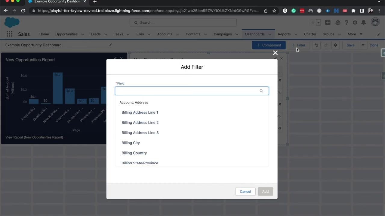
In the Add Filter dialog, use the search bar to find the field you want to filter by, such as Account Address, Billing City, or Billing Country.
-
Click Add to apply the filter, which lets you narrow down data by department, sales team, or other criteria.
You can also use the dashboard editor to sort components by different fields, add a subtitle for additional context, and organize the dashboard by placing it in a folder for better management and sharing. You can toggle between light and dark mode to match your visual preference or organizational standards.
Each dashboard component is powered by a source report, and you can add multiple source reports to a single dashboard — up to nine different reports — to visualize data from different areas, such as sales or service productivity. This lets you monitor key metrics that inform business decisions, such as when to hire new team members, by setting thresholds in your reports so you're alerted when certain numbers are reached.
Line charts are especially useful for visualizing trends across segments, such as sales by region (East, West, Central), and you can filter and segment this data responsively by market or other criteria.
Filter dashboard data by segment or market
-
Click + Filter at the top of the dashboard editor.
-
In the Add Filter dialog, search for and select a field such as "Billing City" or "Billing Country" to filter your data by region or market.
-
Select the appropriate field to filter your dashboard data — for example, to see data only for the "West District" — and click Add to apply the filter.
Dashboard filters let you view the same dashboard for different segments — such as region or owner — without duplicating reports, so you can quickly switch between data subsets or combine multiple segments.
- After applying a filter, the dashboard updates to show only the relevant data. It typically displays visualizations such as bar charts alongside tables, like the "New Opportunities Report" with columns for Opportunity Owner, Account Name, Opportunity Name, Fiscal Period, and Amount.
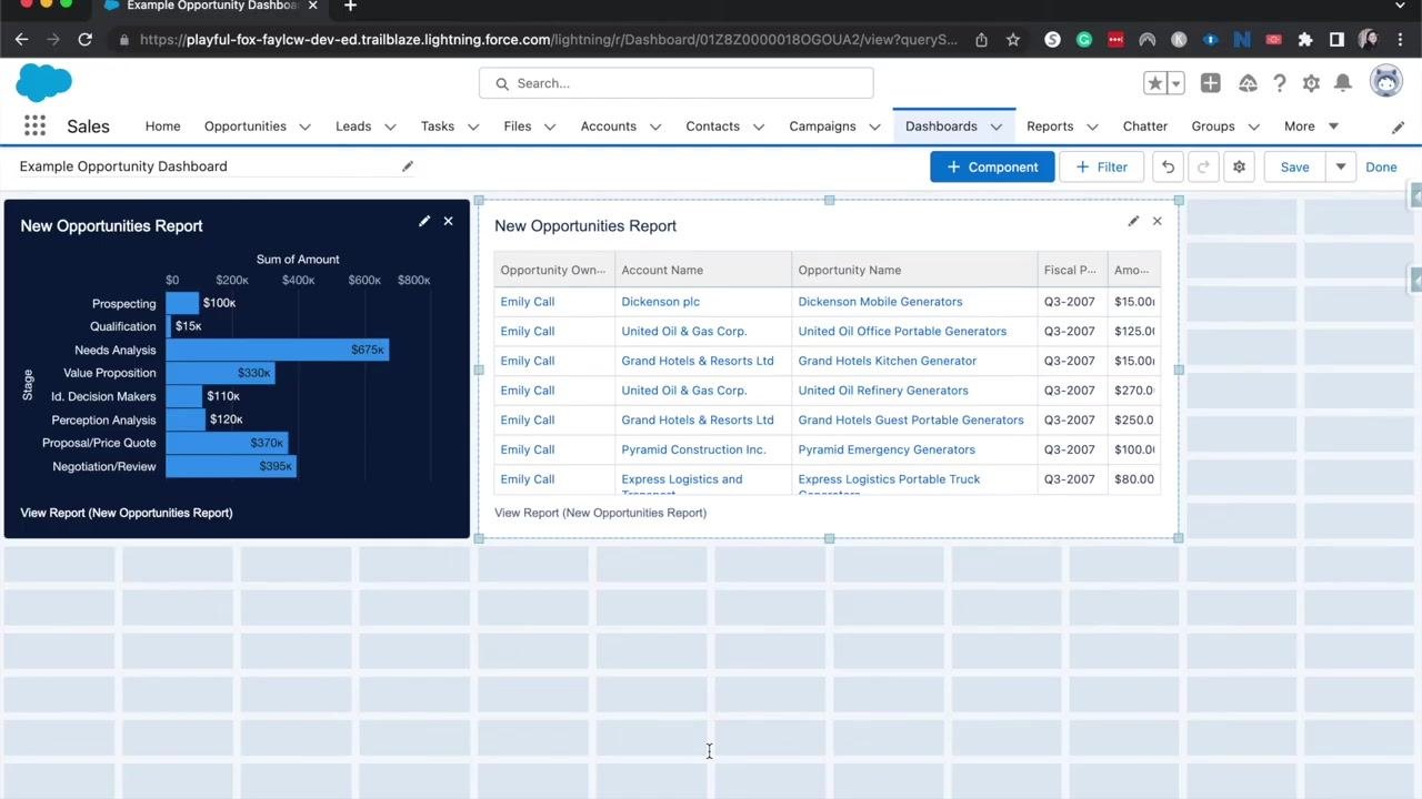
Save and refresh your dashboard
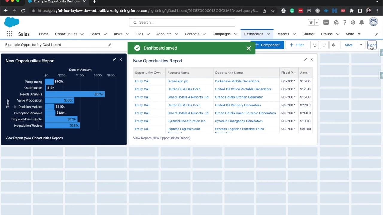
- Click Save to save your dashboard with the new filter settings. A "Dashboard saved" confirmation message appears at the top of the screen. Click Done to exit editing mode.
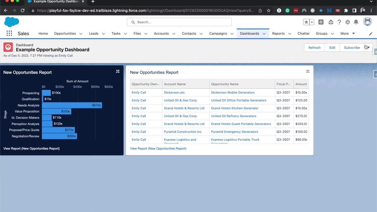
- Dashboards don't update automatically. Click Refresh at the top right whenever you want to see the latest data, ensuring your dashboard reflects the most current information from the underlying reports.
Subscribe to dashboard email updates
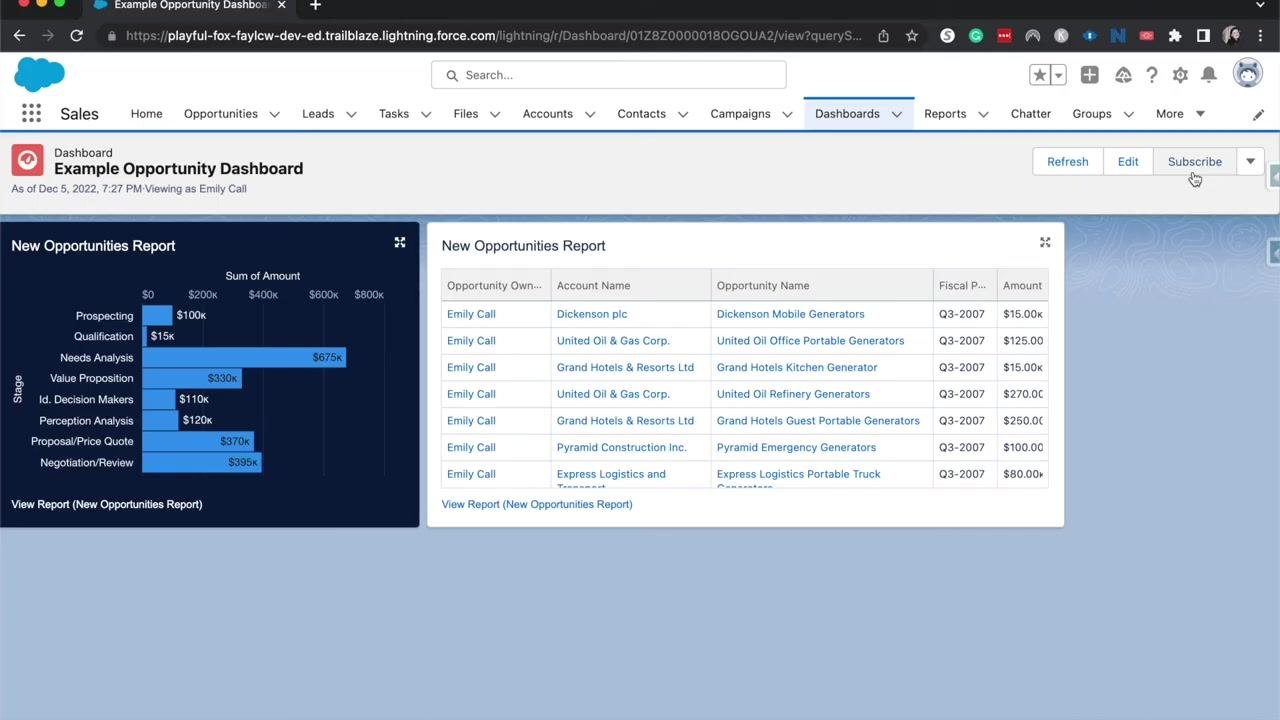
- Click Subscribe at the top right of the dashboard. Subscribing sends the dashboard to your email inbox on a schedule you choose, similar to subscribing to a report.
- Select how often you want to receive updates — daily, weekly, or monthly — and adjust the schedule according to your needs to stay informed about changes in your dashboard data.
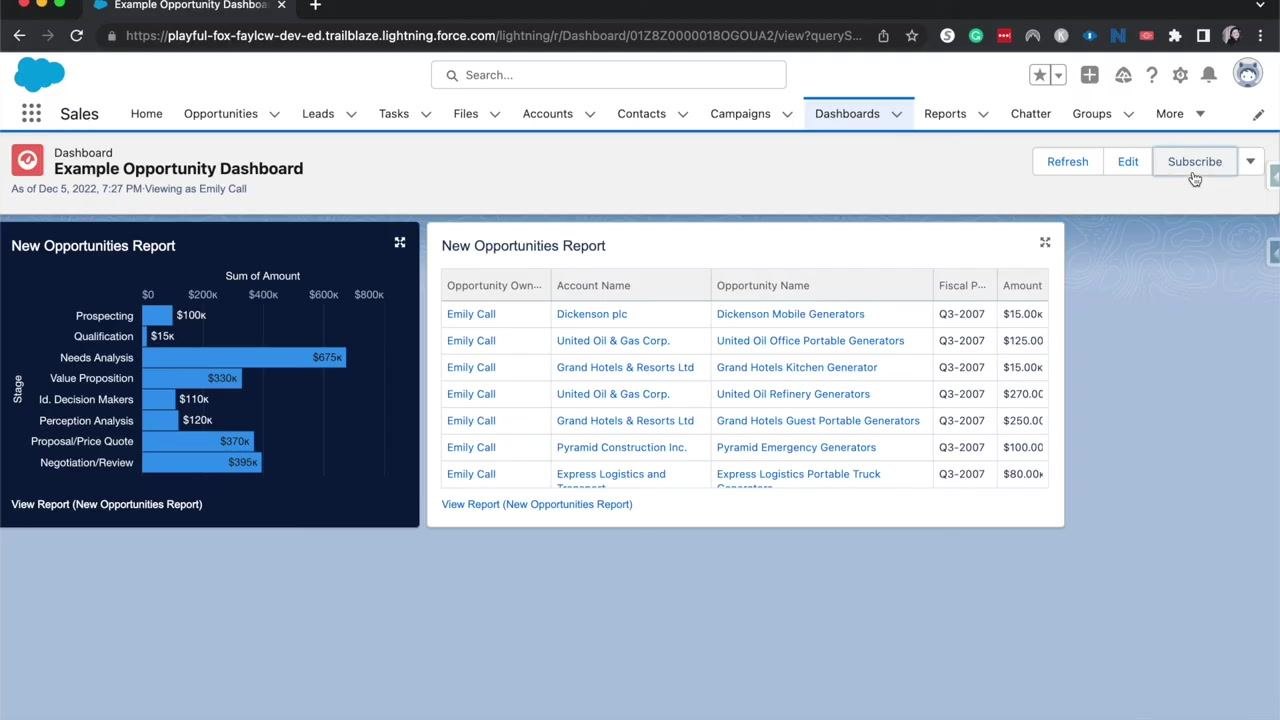
Customize the subscription frequency, day, and time
-
In the Edit Subscription dialog that appears when you subscribe, choose the Frequency for email updates: Daily, Weekly, or Monthly.
-
If you select Weekly, choose the specific days you want to receive updates by clicking the day buttons (for example, Mon for Monday).
-
Set the Time for delivery using the dropdown (for example, 7:00 PM).
-
Make sure the checkbox Receive new results by email when dashboard is refreshed is checked to get email notifications. Note that to add other recipients, the report must be saved in a shared folder.
The dashboard subscription sends updates to the email address associated with your Salesforce organization. If you have a personal email set in your Salesforce profile, updates are sent there; if your organization uses a different email, updates are sent to that address instead.
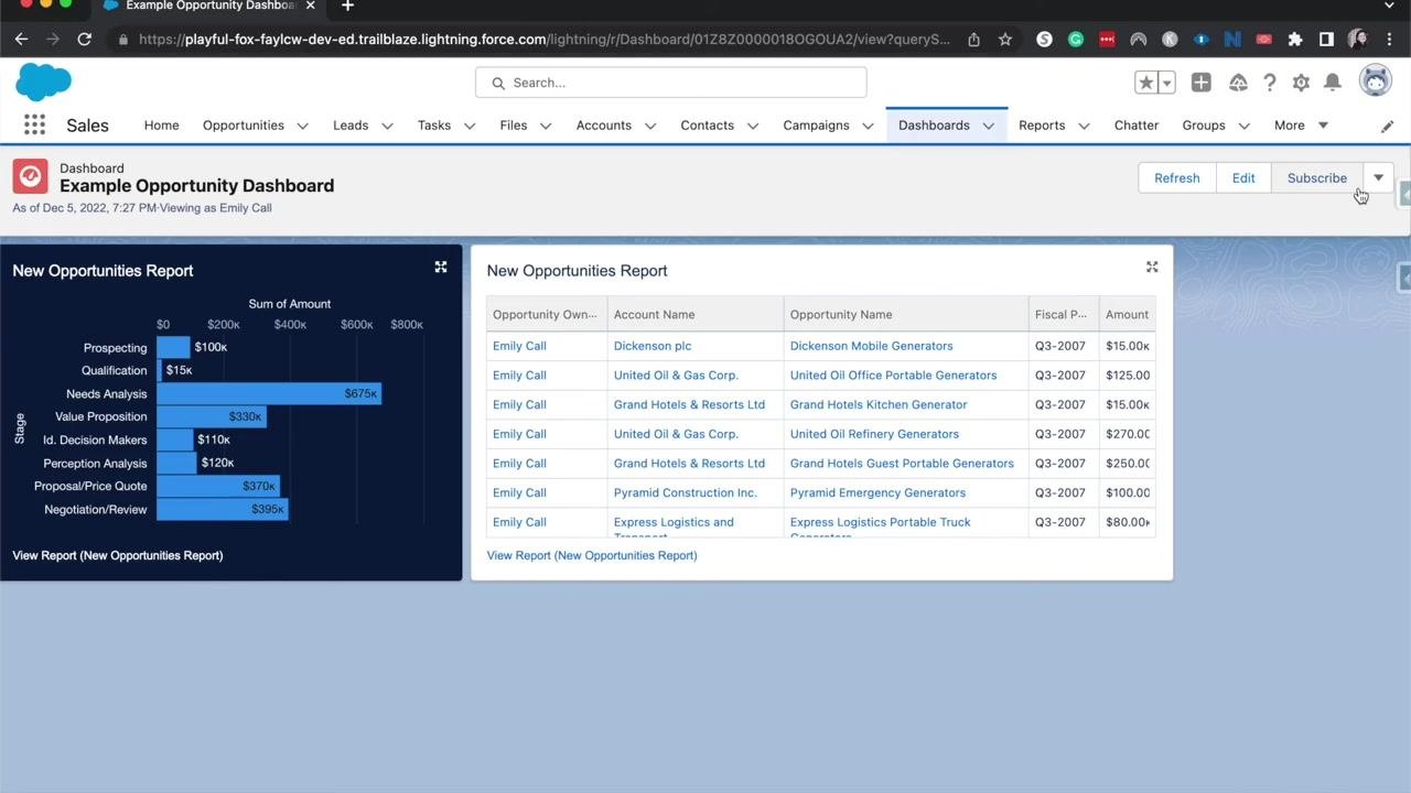
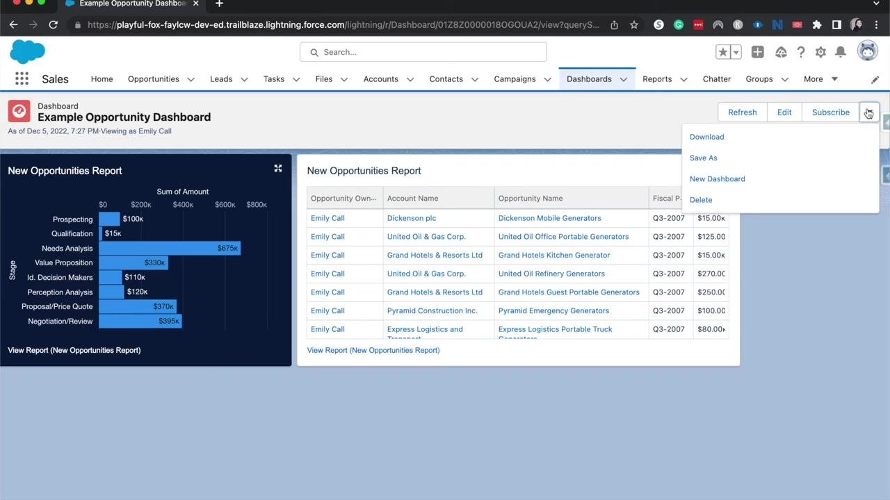
Access additional dashboard actions
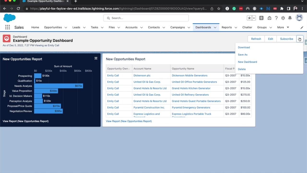
- Click the dropdown arrow next to the Subscribe button to reveal more dashboard management options:
- Download — Save a copy of the dashboard
- Save As — Create a duplicate of the dashboard with a new name
- New Dashboard — Start creating a new dashboard
- Delete — Remove the current dashboard
What's next
Use your finished dashboard to quickly review key performance indicators (KPIs) at a high level — such as opportunity stages and amounts — to monitor business performance efficiently. Keep in mind that only data entered into Salesforce, or imported through integrated methods, will appear in your dashboard, so make sure your data stays clean and accurate to ensure your dashboard reflects the true state of your business.
Generation details: cost, quality tiers
Docsie billed 7,000 credits ($4.90) to analyze this 14-minute video at standard quality. The rewrite, template fill and Word/PDF exports were included. The same video at each quality tier:
| Quality | Frames sampled | Credits | Approx. cost |
|---|---|---|---|
| Draft | every 16-30 s | 3,500 | $2.45 |
| Standard (this guide) | every 8-15 s | 7,000 | $4.90 |
| Detailed | every 4-7 s | 14,000 | $9.80 |
| Ultra | every 1-3 s | 28,000 | $19.60 |
Credits priced at $0.70 per 1,000; plans include a monthly allowance. Enterprise customers on on-premise or bring-your-own-model deployments run this on their own inference and pay no per-video credits.
Generated by Docsie Video-to-Docs on 2026-10-01 from a 13-minute video. Screenshots are frames from the source video and belong to their creator, Salesforce Emily, whose original is embedded above. If you own this video and want the guide removed or credited differently, contact us and we will act within one business day.