
How to Use SlicerDicer in Epic
This guide walks you through how to use SlicerDicer in Epic to build a patient cohort that is clear, reproducible, and easy to explain to colleagues. Using generic mock screens as a reference, you will learn how to set your unit of analysis, apply inclusion criteria, group and measure your results, and save your work so it can be trusted and shared with confidence.
Video: Epic-SlicerDicer-Click-by-Click-Tutorial by Abdulkarim Ben Yezza (Karim). All credit for the demonstration goes to the creator; watch the original on YouTube. The written guide below was generated from this video by Docsie. Creator? Request a change or removal.
This guide walks you through how to use SlicerDicer in Epic to build a patient cohort that is clear, reproducible, and easy to explain to colleagues. Using generic mock screens as a reference, you will learn how to set your unit of analysis, apply inclusion criteria, group and measure your results, and save your work so it can be trusted and shared with confidence.
Prerequisites
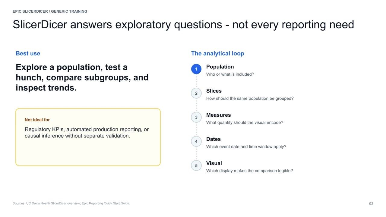
Before you begin, you should understand what SlicerDicer is designed for and what it is not:
- Use SlicerDicer for exploratory questions, such as testing a hunch, inspecting trends within a population, or comparing subgroups.
- Do not use SlicerDicer for formal regulatory reporting, automated production reporting, or causal inference (unless you perform a separate validation).
SlicerDicer is best suited for quick, visual exploration rather than formal, validated reporting.
Understanding the analytical loop
As you build your analysis in SlicerDicer, keep in mind five independent decisions that shape your results:
- Population: Who or what is included?
- Slices: How should the same population be grouped?
- Measures: What quantity should the visual encode?
- Dates: Which event date and time window apply?
- Visual: Which display makes the comparison legible?
Each of these components adjusts your report independently, so understanding how they interact is key to building a cohort you can explain.
Choose the correct data model
Before selecting any filters, decide which data model matches the question you are asking:
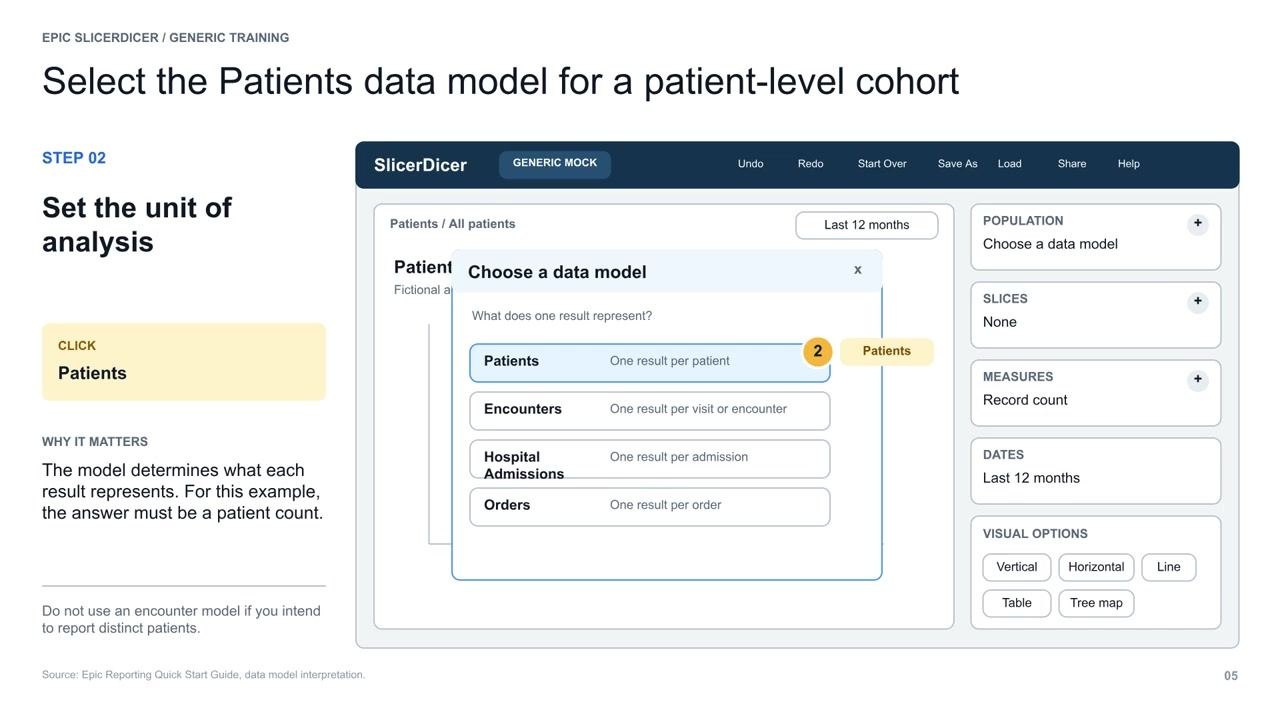
- Patients Data Model: Use when you want cohort counts, where one result equals one patient. For example, a patient with five ED visits still contributes one patient result.
- Encounters Data Model: Use when you need visit counts, where one result equals one encounter. The same patient may contribute several encounter results.
If you choose the wrong unit, every later click can be technically correct while the final answer is still wrong.
Open SlicerDicer from Chart Search
If SlicerDicer is not pinned to your toolbar, you can open it through Chart Search:
- In the search bar, type SlicerDicer.
- Select the SlicerDicer result to begin.
If no result appears, request local access or complete the required training.
Set the unit of analysis
Once SlicerDicer opens, your first step is to set the unit of analysis:
- Click Patients to ensure your results represent individual patient counts rather than encounter counts.
The model you select determines what each result represents, so for distinct patient counts, always select the patient model.
Apply the analysis date window
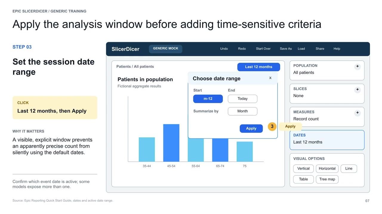
Before adding any time-sensitive criteria, set your analysis date window explicitly:
- Click Last 12 months.
- Click Apply.
This step prevents your report from relying on default date settings that could lead to inaccurate results. Confirm which event date is active, since some models expose more than one.
Add an inclusion criterion to narrow your population
To filter your patient records by clinical condition:
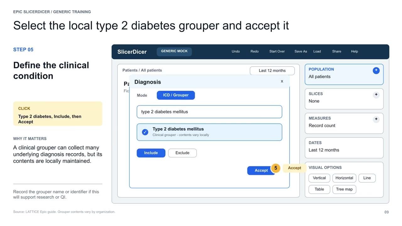
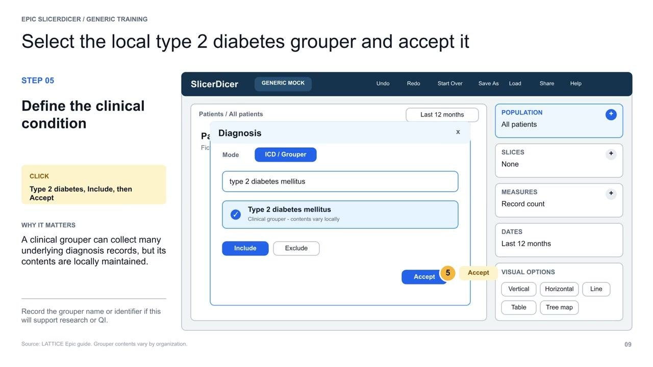
- Click Population, then select Diagnosis.
- In the criteria search, type and select your local type 2 diabetes grouper.
- Click Include, then click Accept.
Record the grouper name or identifier if this will support research or quality improvement work.
Apply the clinical condition to your population
After selecting your grouper, confirm the filter:
- Click Include.
- Click Accept to apply this clinical condition to your population.
This ensures only patients with type 2 diabetes are included in your cohort.
Restrict the cohort to adults (ages 18–75)
Add age as a second population criterion:
- Set the age range by entering 18 as the minimum and 75 as the maximum.
- Click Accept to apply the age filter.
This inclusion criterion automatically updates your total population count to reflect only adults.
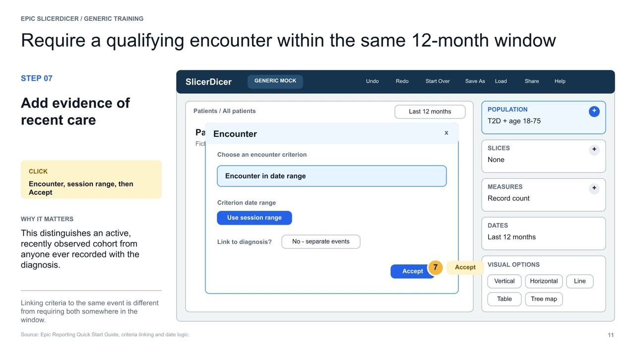
Add evidence of recent care
To ensure your cohort reflects patients seen recently:
- Select an Encounter criterion.
- Set the criterion to Encounter in date range.
- Click Use session range to apply your active session date window (for example, Last 12 months).
- Confirm that Link to diagnosis? is set to No – separate events, unless your analysis requires otherwise.
- Click Accept to apply the encounter filter.
Group results by age group
To visualize how your data is distributed across age demographics:
- Click Slices in the right panel.
- Add Age group as a slice.
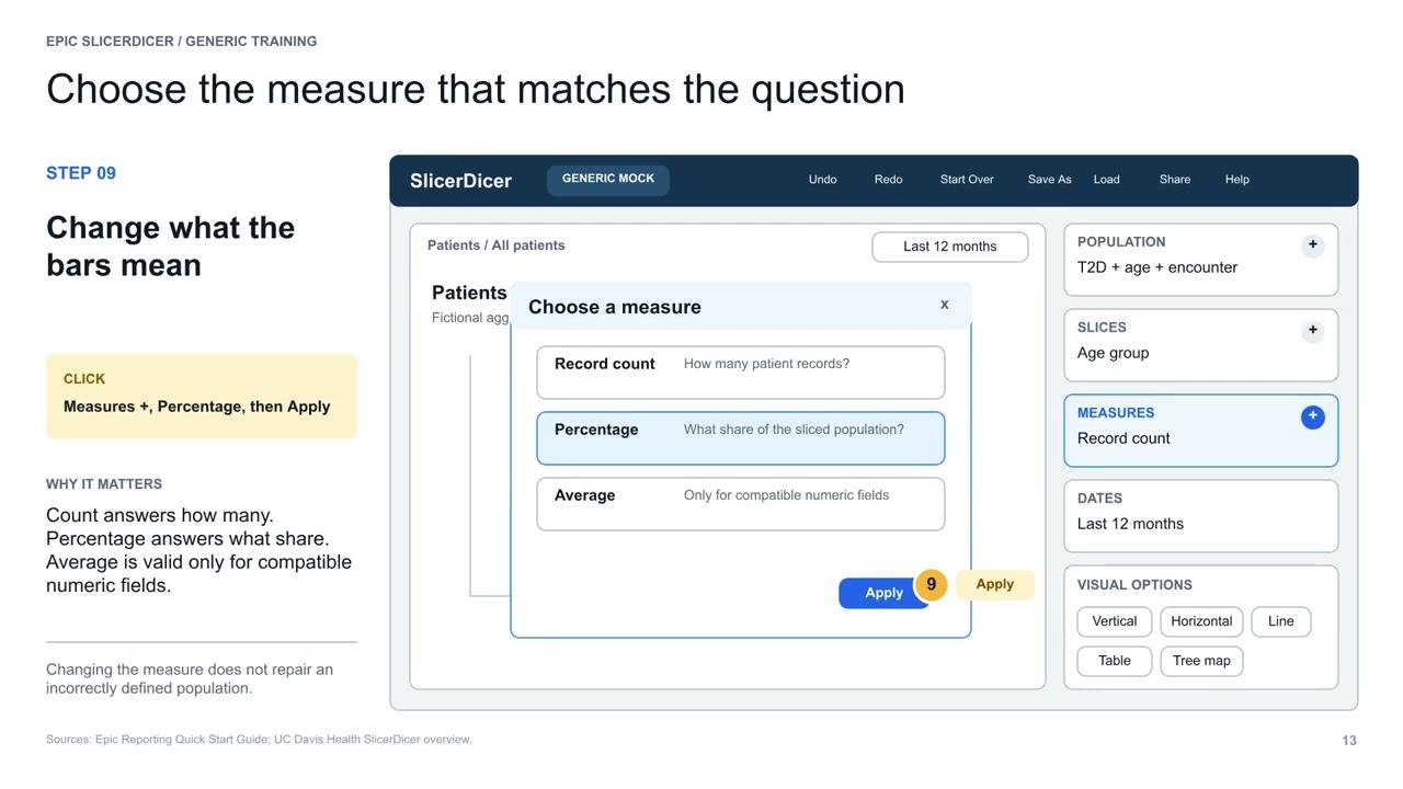
Configure your measures
To see proportional results rather than raw counts:
- Click the Measures + button.
- Select Percentage to see the share of the population in each age group.
- Click Apply to update the visualization.
Adjust visual options for clarity
If category labels in your chart feel crowded:
- Click Visual Options.
- Select Horizontal to switch to a horizontal bar chart.
This makes comparisons between groups more legible while keeping the underlying data unchanged.
Drill down and undo as needed
To explore a specific subgroup:
- Double-click any bar in the chart to drill into that subgroup for deeper analysis.
- Use the Undo button in the toolbar to return to your parent population.
Save your session with a clear, descriptive name
To preserve your cohort's logic for later use:
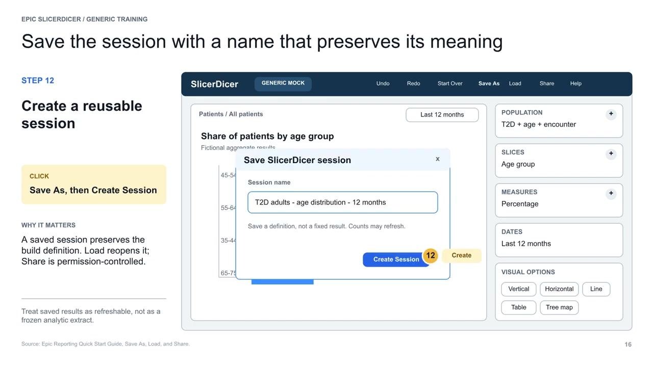
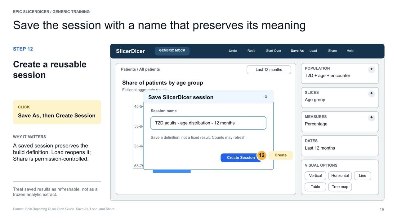
- Click Save As in the toolbar.
- Enter a session name that reflects the meaning and logic of your cohort, for example, T2D adults – age distribution – 12 months.
- Click Create Session to save your work.
This allows you to reload or share the exact logic later, treating your results as a refreshable, dynamic set rather than a static snapshot.
Understanding saved results as dynamic
A saved session preserves the build definition, not a fixed result — counts may refresh as data updates. Sharing is permission-controlled, so only authorized users can access shared sessions.
Performing final checks before sharing or trusting results
Before you trust or share your numbers, run through these six quick checks:
- Verify the unit of analysis.
- Confirm your date window.
- Check the logic of your inclusion/exclusion criteria.
- Account for missing data.
- Ensure your measures and visualizations match your question.
- Review for any other context-specific considerations.
Reviewing the measure type and performing a face validity check
After configuring your measures, review the selected measure type to confirm it aligns with your analysis goals. Perform a quick face validity check by confirming that the results make sense given your knowledge of the population and question. If results appear unexpected, revisit your filters, slices, and measure definitions for possible errors.
Ensuring proper governance and validation for research use
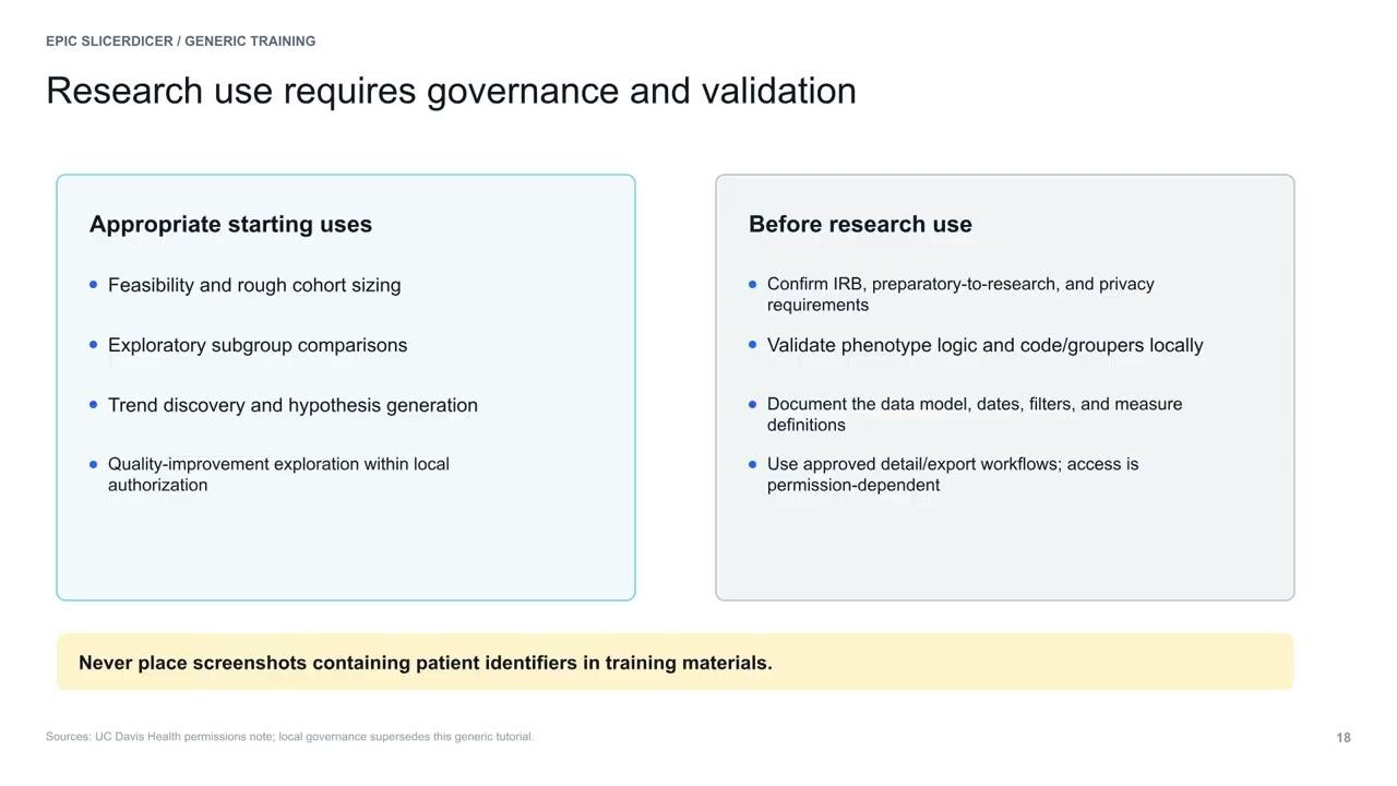
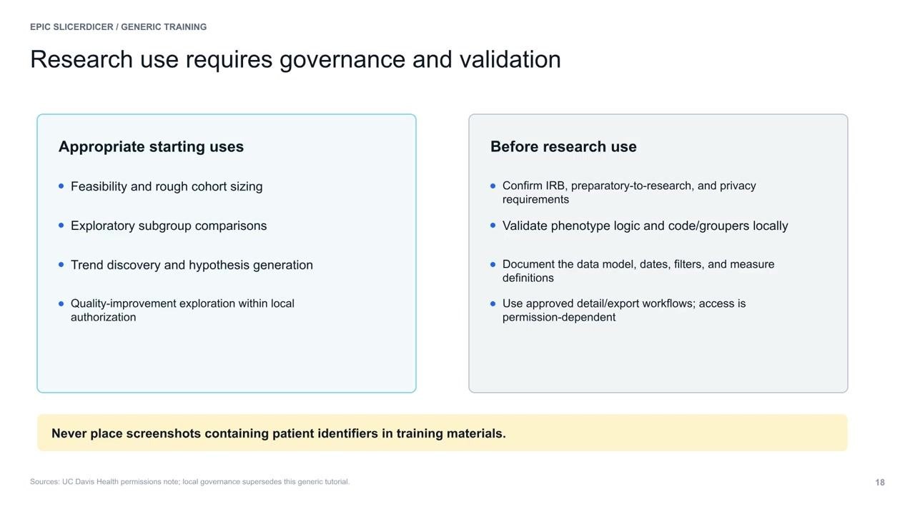
If you are using SlicerDicer for research purposes, confirm the appropriate governance and approvals are in place:
- Confirm IRB (Institutional Review Board) or preparatory-to-research and privacy requirements.
- Validate phenotype logic and code/groupers locally.
- Document the data model, date ranges, filters, and measure definitions used.
- Use only approved detail/export workflows, as access is permission-dependent.
Refer to your institution's policies for additional requirements.
Protecting patient privacy in shared materials
Never include screenshots or exports containing patient identifiers in your shared screenshots, reports, or training materials. Always de-identify data before sharing or presenting.
The repeatable SlicerDicer recipe
Use this structured approach for every SlicerDicer analysis:
- Frame: Write the unit, population, window, and outcome before opening Epic.
- Model: Choose the data model that returns the correct unit.
- Filter: Build inclusion and exclusion criteria, then inspect the definitions.
- Slice: Group the same population to expose meaningful variation.
- Measure: Choose the statistic that answers your question.
- Validate: Check dates, logic, missingness, and face validity.
- Save: Use a descriptive session name and document the build.
This recipe ensures your work is robust, reproducible, and easy to review.
Summary
By following these steps, you now know how to use SlicerDicer in Epic to build a clearly defined, explainable cohort — from selecting the right data model and applying inclusion criteria, to configuring measures, validating your results, and saving your session for future use. With your question framed, model selected, filters and slices applied, measure chosen, output validated, and work saved, you are ready to begin exploring your data in Epic SlicerDicer. Always prioritize data privacy and institutional governance throughout your workflow.
Generation details: cost, quality tiers
Docsie billed 2,000 credits ($1.40) to analyze this 4-minute video at standard quality. The rewrite, template fill and Word/PDF exports were included. The same video at each quality tier:
| Quality | Frames sampled | Credits | Approx. cost |
|---|---|---|---|
| Draft | every 16-30 s | 1,000 | $0.70 |
| Standard (this guide) | every 8-15 s | 2,000 | $1.40 |
| Detailed | every 4-7 s | 4,000 | $2.80 |
| Ultra | every 1-3 s | 8,000 | $5.60 |
Credits priced at $0.70 per 1,000; plans include a monthly allowance. Enterprise customers on on-premise or bring-your-own-model deployments run this on their own inference and pay no per-video credits.
Generated by Docsie Video-to-Docs on 2026-10-06 from a 3-minute video. Screenshots are frames from the source video and belong to their creator, Abdulkarim Ben Yezza (Karim), whose original is embedded above. If you own this video and want the guide removed or credited differently, contact us and we will act within one business day.