
How to Create a Report in ServiceNow
This guide walks you through how to create a report in ServiceNow, from opening the Reports module to configuring, visualizing, and exporting your finished report. You'll learn how to build a report on Change Request data, apply grouping and filters, switch between visualization types, and export the results in formats like Excel, CSV, or PDF.
Video: How to Create Reports in ServiceNow by Beyond20 (2021). All credit for the demonstration goes to the creator; watch the original on YouTube. The written guide below was generated from this video by Docsie. Creator? Request a change or removal.
This guide walks you through how to create a report in ServiceNow, from opening the Reports module to configuring, visualizing, and exporting your finished report. You'll learn how to build a report on Change Request data, apply grouping and filters, switch between visualization types, and export the results in formats like Excel, CSV, or PDF.
Prerequisites
- Access to a ServiceNow instance with an active login session.
- Visibility into the homepage dashboard before you begin.
- If the Reports module does not appear in your navigation menu, contact your ServiceNow administrator and request ITIL access to enable reporting features.
Open your ServiceNow homepage
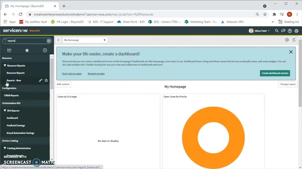
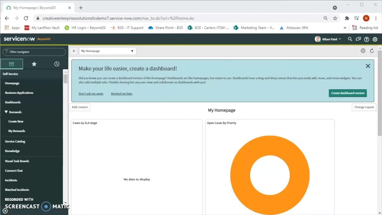
Open your web browser and navigate to your ServiceNow instance. Confirm you are logged in and can see the homepage dashboard, which typically displays widgets such as "Cases by SLA stage" and "Open Cases By Priority."
Find the Reports module
In the left navigation pane, locate the filter navigator at the top and type reports into the search box. This surfaces the Reports module in the menu. If the module doesn't appear, contact your ServiceNow administrator to request ITIL access.
Open the Reports section and view existing reports
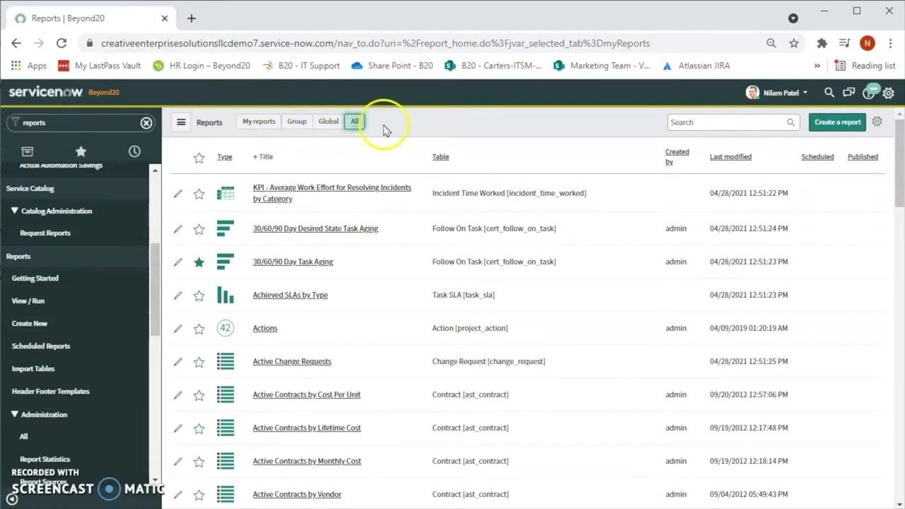
Expand the Reports section in the left navigation to see options such as Getting Started, View / Run, Create New, and Scheduled Reports. Click View / Run to display the main panel listing all available reports.
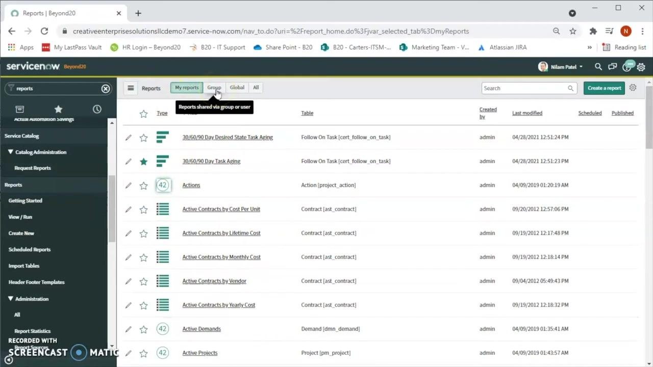
The report list includes tabs for My reports, Group, Global, and All, along with columns for Type, Title, Table, Created by, Last modified, Scheduled, and Published.
Switch between report views
Click the Group tab to see reports shared with your group or user, or click the All tab to view every report you can access, including your own, group, and global reports.
Start creating a new report
Click the green Create a report button in the upper right corner of the report list panel to begin building a new report. The following steps demonstrate creating a report for Change records based on different criteria.
Name your report
In the Create a report window, locate the Report name field and type Change report. You may see suggestions for existing report names, such as "30/60/90 Day Task Aging" or "Quarterly change report" — ignore these and continue with your chosen name.
Set the source type and select the table
In the Source type dropdown, ensure Table is selected. Click the Table dropdown, type change re to filter the list, and select Change Request [change_request]. If you're unsure which table to use, contact your ServiceNow administrator for guidance.
Choose the report type
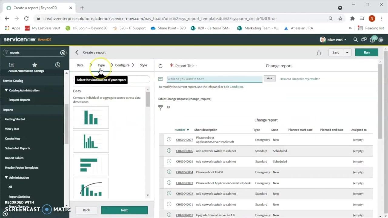
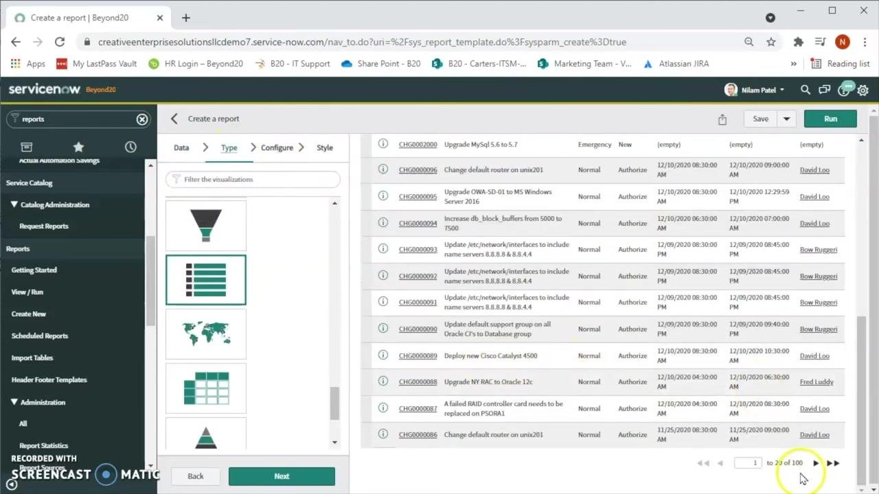
Click Next to reach the Type step, where you select the visualization for your report. Available options include Bars, Time Series, Pies, Donuts, and Multidimensional reports. ServiceNow defaults to the List type, which is suitable for a tabular report.
Review the initial data preview
After selecting the table and type, a preview of the report data appears, showing columns such as Number, Short description, Type, State, Planned start date, Planned end date, and Assigned to. This preview confirms that 100 change records are included.
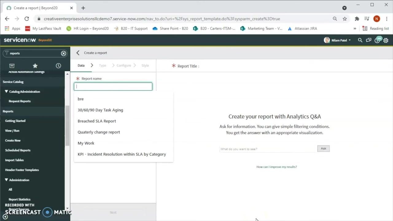
Configure the report columns
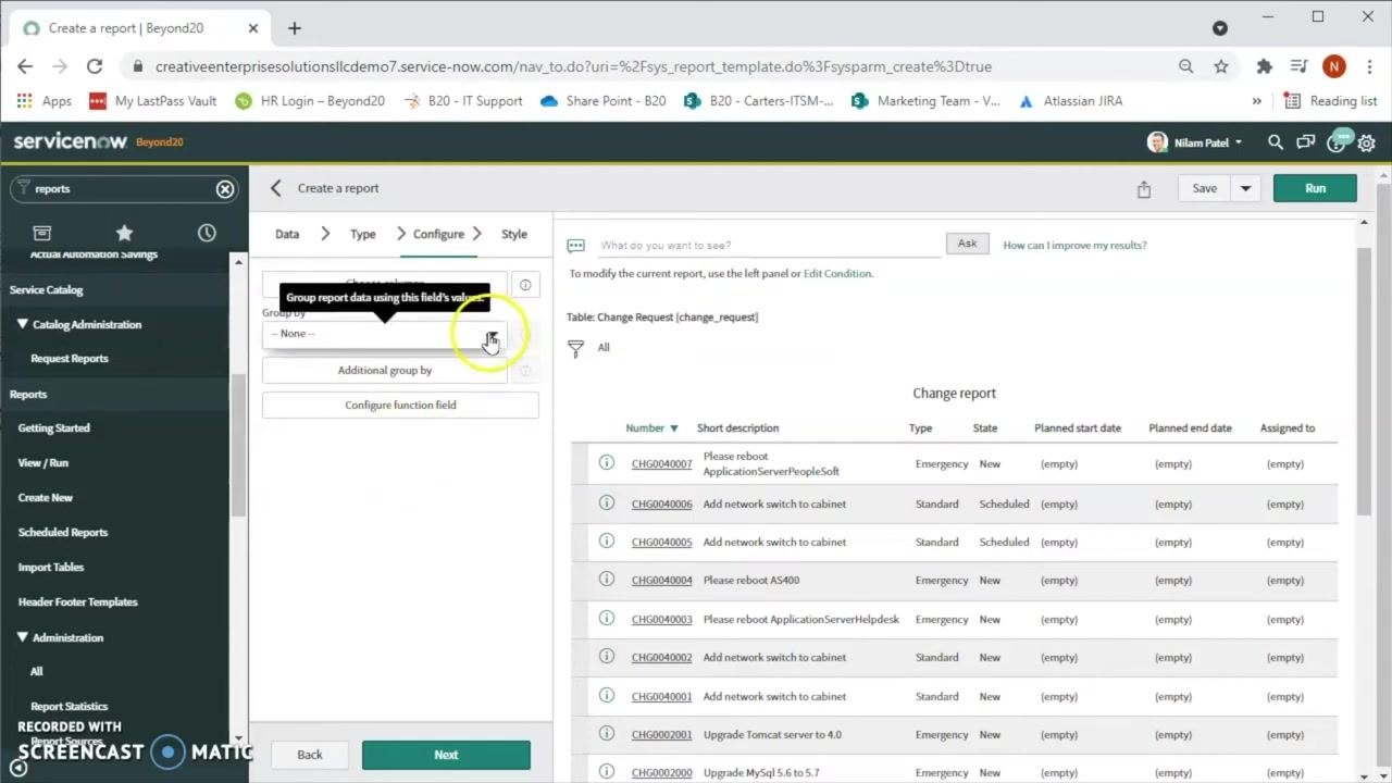
Click Next to open the Configure step. In the Choose columns section, click the column selector icon to add or remove fields as needed. You can also group data by specific fields or configure function fields for advanced calculations.
Group the report data
In the Configure step, locate the Group by dropdown and select a field, such as Active, to group change requests by their active status. This lets you see how many requests are currently active versus inactive.
Run the grouped report
Click Run in the upper right corner to execute the report with the selected grouping and review the resulting counts, such as 89 active and 11 inactive change requests.
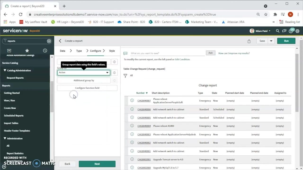
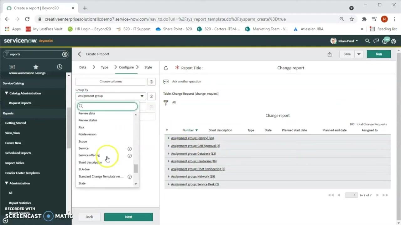
Group by assignment group
In the Group by dropdown, select Assignment group to organize change requests by team, then click Run. The report will display groups such as "CAB Approval," "Database," "Hardware," "ITSM Engineering," "Network," and "Service Desk."
Group by state
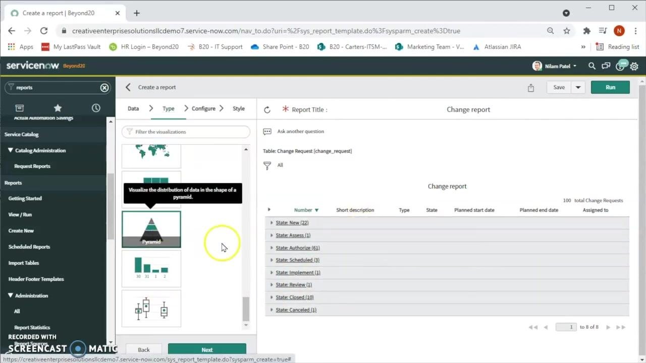
In the Group by dropdown, select State and click Run to view change requests grouped by status, such as "New," "Assess," "Authorize," "Scheduled," "Implement," "Review," "Closed," and "Canceled."
Change the report visualization
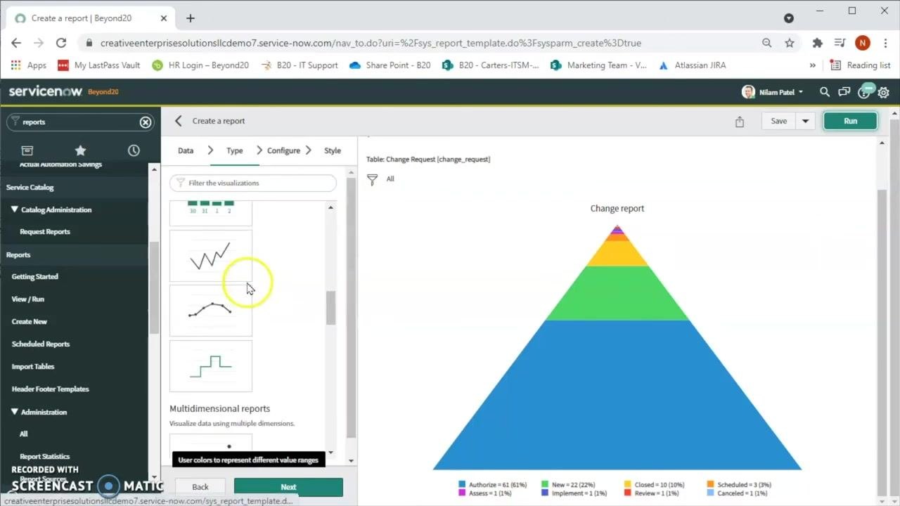
Navigate to the Type tab to change how your report is displayed. Select Pyramid to view the distribution of change requests as a pyramid chart, then click Run to update the report.
Switch to the Pie visualization
In the Type tab, scroll through the available visualization options and select Pie. Click Run to regenerate the report using the pie chart format. Use the color legend below the chart to interpret the distribution of change requests by state.
Select a bar chart visualization
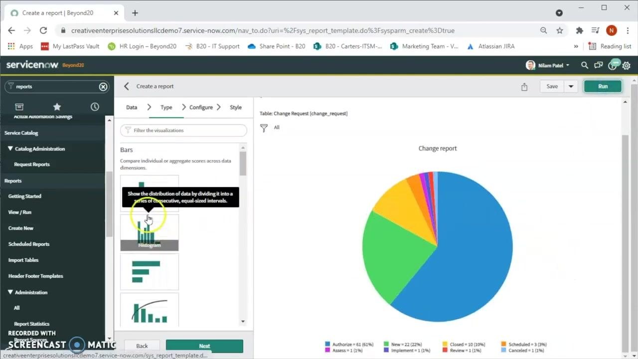
In the Type tab, choose a bar chart option under Bars, such as Histogram. Hovering over each option shows a tooltip describing its purpose — for example, a histogram "shows the distribution of data by dividing it into a series of consecutive, equal-sized intervals."
Configure the bar chart report
Switch to the Configure tab and set Group by to State to categorize data by change request status. Set Stack by to None unless you need additional segmentation, and set Aggregation to Count to display the number of records per state.
You can also adjust optional settings: - Additional group by for further segmentation - Display data table to show the underlying data - Set Value Formatting to adjust how values appear - Max number of groups (default: System Default) - Show Other, which groups less common states together
Export the report data
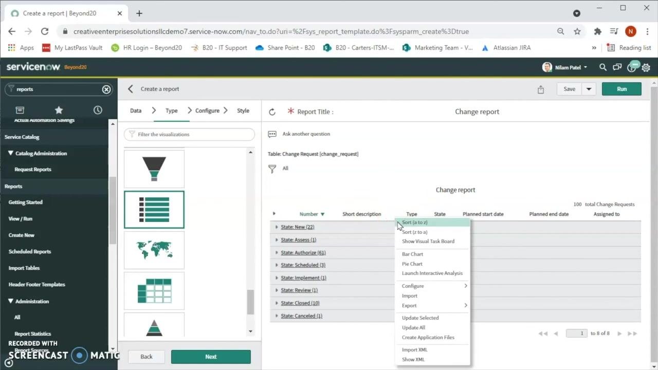
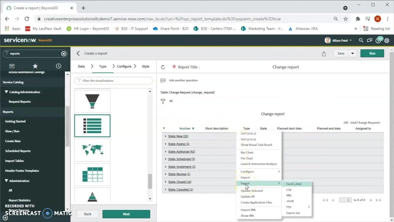
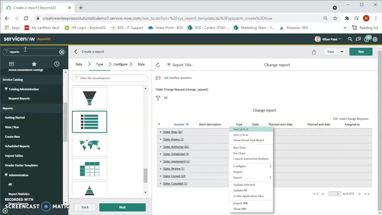
Switch to a list view of the report, then right-click a column header to open the context menu. Hover over Export to see the available formats — Excel (.xlsx), CSV, XML, JSON, or PDF — and select the one you need.
Access reports anytime from the navigation menu
To return to reports later, type reports in the navigation search bar. Click Create New to start another report, or View / Run to access existing ones.
What's next
You now know how to create a report in ServiceNow, from selecting a table and visualization type to grouping data, switching chart formats, and exporting results. Continue exploring by applying additional filters — such as filtering by Assigned to — or experimenting with other visualization types to find the format that best represents your data. Always click Run after making changes to see the updated report.
Generation details: cost, quality tiers
Docsie billed 3,500 credits ($2.45) to analyze this 7-minute video at standard quality. The rewrite, template fill and Word/PDF exports were included. The same video at each quality tier:
| Quality | Frames sampled | Credits | Approx. cost |
|---|---|---|---|
| Draft | every 16-30 s | 1,750 | $1.22 |
| Standard (this guide) | every 8-15 s | 3,500 | $2.45 |
| Detailed | every 4-7 s | 7,000 | $4.90 |
| Ultra | every 1-3 s | 14,000 | $9.80 |
Credits priced at $0.70 per 1,000; plans include a monthly allowance. Enterprise customers on on-premise or bring-your-own-model deployments run this on their own inference and pay no per-video credits.
Generated by Docsie Video-to-Docs on 2026-09-08 from a 6-minute video. Screenshots are frames from the source video and belong to their creator, Beyond20, whose original is embedded above. If you own this video and want the guide removed or credited differently, contact us and we will act within one business day.